A Colourful Portrait of Stefan Batory

Single-leaf woodcuts, printed separately from books, were known in Europe since the fifteenth century. The images, usually with additional text, were printed only on one side of the sheet of paper. It was a popular form of printing in German countries. Many Einblattholzschnitte were coloured, often with the use of stencils. It seems that single-leaf woodcuts were quite rare in Poland; it might be caused either by the lack of preserved examples or insufficient research on this issue.

Among numerous representations of Stefan Batory there is a group of images which show the king in a similar way. They represent the ruler as the Prince of Transylvania, in a characteristic attire. This schemata was introduced by an etching made by Jost Amman in 1576 and repeated later by painters and printers (Mrozowski 2021: 176). One of such repetitions was a colourful single-leaf woodcut, a half-length portrait of Batory, face three-quarter to the right.
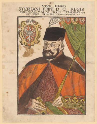
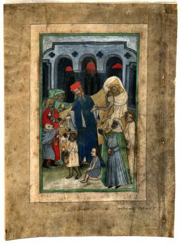
Fig. 1. Portrait of Stefan Batory (Viva imago Stephani Primi…), woodcut, Cracow (?), 1576 (?), Graphische Sammlung und Fotoarchiv, Zentralbibliothek Zürich, Zürich, Inv. no 000003583. Source: graphikportal.org (public domain).

Four editions of this print have been mentioned in the literature so far: an unknown one from the National Library (Komornicki 1935: 24), another one from the collection of Johann Jacob Wick, which is held in the Graphische Sammlung of the Zentralbibliothek in Zürich (fig. 1, inv. no 000003583, Pirożyński 1993: 92-92; Pirożyński 1995: 294, cat. 14) and, finally, two prints which belong to Książnica Kopernikańska in Toruń (inv. no K. fol. 143, Pirożyński 1993: 93-94). The last two images are incomplete and each of them is cut into two pieces; one presents the left part of the composition (fig. 2) and the other one its right part (fig. 3). The bottom part is missing in both of them.

These two woodcuts are accompanied with fragments of inscription in Polish, which elicits the titles of the ruler: VIVA IMAGO Naiasnieiszego Pana a Pana Stephana pierwszego | z Bożey łaski Króla Polskiego | wielkiego Książęcia Litewskiego | Ruskiego | Pruskiego | Zmodz-kiego | Mazowieckiego | Infanckiego | Woiewody Siedmigrockiego. Etc. Almost identical inscription, but written in Latin, occurs on the exemplar from Zürich: VIVA IMAGO | STEPHANI PRIMI D. G. REGIS | POLONIAE, MAGNI DVCIS LITVANIAE & CET | NEC NON PRINCIPIS TRANSILVANIAE, &cet.
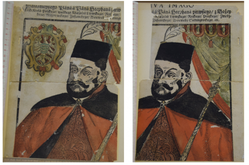
Fig. 2, fig. 3. Portrait of Stefan Batory, (Viva imago Naiasnieiszego Pana…), woodcut, Cracow / Toruń (?), 1576 (?), Książnica Kopernikańska in Toruń, inv. no: K. fol. 143. Source: photo by Karolina Mroziewicz.

The composition, closed in a black frame, depicts the half-length figure of the ruler, three-quarters to the right. Batory is dressed in an elegant patterned robe, precisely a long linen garment called żupan, covered with delia – a garment which resembles a coat, with a collar made of fur. Kolpak, a headgear with a white feather, decorates his head. The king holds a sceptre in his left hand, while in the right one he carries the hilt of a sabre. On the left side there is a cartouche with the white eagle and the king’s coat of arms: three wolf’s fangs. The right part is closed by a curtain with pelmet and tassels.

All these elements refer to Batory as the Prince of Transylvania. Among the wide variety of dresses worn in the sixteenth-century Commonwealth of Poland, the king was depicted in the one which emphasised his Hungarian legacy. Although there was no one typical attire, Polish dresses were generally strongly influenced by Hungarian and oriental trends due to close connections with Hungary and the East during Batory’s reign as well as the idea of deriving Polish noblemen from the ancient Sarmatians (Ostrowski 2019: 271). Polish and Hungarian attire of that time had a lot in common. They were both derived from Turkey and stood in opposition to the Western fashion. Batory consciously chose to be represented in a way which would be associated with his Transylvanian roots and Hungarian connections.

All extant editions of the woodcut were coloured by hand, partially with the use of stencils, which is visible in the outer, red part of the coat, but also in the headgear and green surface of the curtain. The colours are limited to red, green, yellow, dusty pink, blue or light green and black or brown, depending on the edition. Generally, the location of colours is similar in all variants, but there are some differences in the part of cartouche, tassels and the visible fragment of hair. Furthermore, the hues differ slightly, especially in the part of fur, headgear, beard and moustaches, which are brown in the woodcut from Zürich and black in both prints from Toruń.

The questions of where and when were the woodcuts printed have not been solved yet. The one from Wick’s collection was thought to be printed in Nuremberg by Lucas Mayer active between 1566 and 1605, which is rather doubtful (Strauss 1975: 723, cat. 22). Another hypothesis links it with Cracow, the biggest centre of print production in the Commonwealth of Poland at that time. Bruno Weber suggested that the portrait could have been brought to Zürich by the humanist and theologian Krzysztof Trecy (ca. 1530-ca. 1590), who visited Switzerland eight times between 1567 and 1577 (Weber 2015: 90).

Nevertheless, it is assumed that the two woodcuts from Książnica were printed elsewhere. They were found in the cover of Eutropius’ Chronica (inv. no MAG 100020) printed by Melchior Nering, who was active in Poznań, but also Grodzisk Wielkopolski and Toruń (Kawecka-Gryczowa 1962: 282). When the book got to the collection this waste paper was taken out of its cover and restored. The connection between the book and discovered pieces of woodcuts resulted in associating them with Nering. The cover of Chronica was dated 1581 when the printer worked in Grodzisk. According to the researchers, these woodcuts were produced by Nering in Grodzisk either in 1579 (Komornicki 1935: 24) or between 1579 and 1581 (Kawecka-Gryczowa 1962, 282). Other hypotheses indicate that they were created in Toruń in the period between 1581 and 1587 in the printing house of Nering or Andrzej Koteniusz (Tujakowski 1970: 18; Jarzębowski 1969: 86).

Even if the question of place of production is unresolved, the issue of the portrait’s function seems to be obvious. Batory was known as the ruler who put strong emphasis on political propaganda. Such single-leaf woodcuts were presented in public places in the Commonwealth and served as a propaganda tool against the supporters of emperor Maximilian II, who was claimed as a king of Poland before Batory. Another example which evidences such function is a half-length portrait of the king, three-quarters to the right. The coat of arms, depicted next to the figure, is praised in a poem accompanying the print (Komornicki 1935: 18; Pirożyński 1992). The woodcut held in the Sächsische Staatsarchiv in Dresden might be the only existing example of this print (10697, no 64, 368-369). Again, it was coloured by hand.

Colours played an important role in this kind of formal portraits. They emphasised the meaning of each element; the coat of arms promoted Batory as a king, the sceptre recalled his function, while the sabre underlined his bravery. The latter referred to his affiliation to the noblemen, but was also a typical addition to Polish and Hungarian attire. The royal insignia, the sabre and the cartouche were painted yellow, which makes them more visible in comparison to the dark hues of other elements. If we assume that these woodcuts were hung on the walls in public places the fact that they were colourful made them very eye-catching.

Although the iconography of presented portraits seems to be quite typical for Batory’s images, the form of the print is rather exceptional in Polish context. If some of the sixteenth-century graphic portraits can be treated as the repetitions of paintings which do not exist anymore (Mrozowski 2021: 649-650), it is possible that these woodcuts belong to this group. They could also serve as patterns or, at least, as the source of motives for later painted or printed representations of Stefan Batory.

Quoted literature: 

Jarzębowski, Leonard, 1969. Druki toruńskie XVI wieku. [The sixteenth-century prints from Toruń] Toruń: Państwowy Instytut Wydawniczy.

Kawecka-Gryczowa, Alodia, 1962. “Melchior Nering.” In: Drukarze dawnej Polski od XV do XVIII wieku [Printers in old Poland from the 15th- to the 18th-century], vol. 4, pp. 272-291.Wrocław, Kraków: Zakład Narodowy im. Ossolińskich, Wydawnictwo Polskiej Akademii Nauk.

Komornicki, Stefan, 1935. Essai d’une iconographie du roi Etienne Batory. Cracovie: Académie Polonaise des Sciences et des Lettres: Académie des Sciences Hongroise.

Mrozowski, Przemysław, 2021. Portret w Polsce w XVI wieku [The 16th-century portrait in Poland], Warszawa: Muzeum Pałacu Króla Jana III w Wilanowie.

Ostrowski, Jan K., 2019. Portret w dawnej Polsce [Portrait in old Poland], Warszawa: Muzeum Pałacu Króla Jana III w Wilanowie.

Pirożyński, Jan, 1992. “Plakat propagandowy na cześć Stefana Batorego wydany po jego elekcji (Ze zbiorów Archiwum Państwowego w Dreźnie)” [Propaganda poster printed in honour of Stefan Batory after his election (from the collection of the National Archive of Dresden)]. In: Roczniki Biblioteczne, vol. 42, pp. 129-135.

Pirożyński, Jan, 1993. “Kilka nieznanych lub mało znanych batorianów ze zbiorów Centralnej Biblioteki w Zurychu” [Few unknown or little known batoriana from the Central Library in Zürich]. Roczniki Biblioteczne, vol. 37, Wrocław: Państwowe Wydawnictwo Naukowe, pp. 83-103.

Pirożyński, Jan, 1995. Z dziejów obiegu informacji w Europie XVI wieku. Nowiny z Polski w kolekcji Jana Jakuba Wicka w Zurychu z lat 1560-1587 [The history of circulation of information in the 16th-century Europe. News from Poland in the collection of Johann Jacob Wick in Zürich between 1560 and 1587], Kraków: Uniwersytet Jagielloński, 1995.

Strauss, Walter L., 1975. The German single-leaf woodcut 1550-1600: a pictorial catalogue. Vol. 2, K-R. New York: Abaris Books.

Tujakowski, Alojzy, 1970. Z dziejów drukarstwa i piśmiennictwa na Pomorzu: 400 lat drukarstwa w Toruniu 1569-1969 [The history of printing and literature of Pomerania: 400 years of printing in Toruń 1569-1969], Warszawa: Ludowa Spółdzielnia Wydawnicza.

Weber, Bruno, 2015. “Eine Sammlung von Porträts. Variationen über das repräsentative Zur-Schau-Stellen”. In: Glanzlichter. Meisterwerke aus der Graphischen Sammlung und dem Fotoarchiv der Zentralbibliothek Zürich, Zürich: Zentralbibliothek Zürich, pp. 81-101.
How to Decipher a Cracow Single-Sheet Annual Calendar?

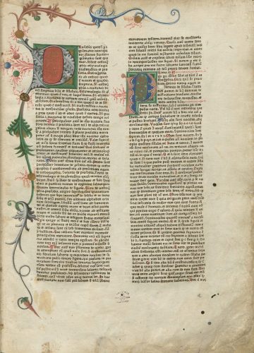
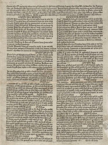
To interpret the earliest known calendar printed in Cracow one had to be well versed in Latin. The Almanach Cracoviense ad annum 1474 (fig. 1), which is considered to be the first print produced in Cracow, is a single sheet of paper (26 x 37 cm) with text printed single-sided in two columns with black ink. It was produced by an itinerant Bavarian printer, Kasper Straube, who established his printing shop and worked in Cracow between 1473 and 1477.

Fig. 1. Almanach Cracoviense ad annum 1474 (Cracow: Kasper Straube, ca 1473). Single-sheet annual calendar. Jagiellonian Library, Cracow, shelf-mark Inc. 1998. Source: Jagiellonian Digital Library (public domain).

Apart from the text layout, nothing else eased the task of the reader, who had to retrieve all necessary information from a plain text.  It was dense with information such as dates of feasts given according to the liturgical calendar, conjunctions and eclipses of the Moon and Sun as well as the time most suitable for bloodletting, which depended on age, type of personality and the particular illness.

Kasper Straube did not use red ink in any of his Cracow prints, but German printers embellished their calendars and organized the information in a more intuitive way with the use of red already in the 1470s. It is impossible to establish a fixed date when colour was introduced to Cracow broadside calendars. There is a black-and-white photograph of a bi-colour Polish-language calendar from ca. 1519/1520, but the current location of the original remains unknown since the 1980s (Wydra 2010). Perhaps attempts to introduce double-ink printing to the production of broadside calendars in Cracow were made before the 1520s, but the fact that single sheet calendars were the most used and easily disposable prints, made it difficult to find earlier examples.   

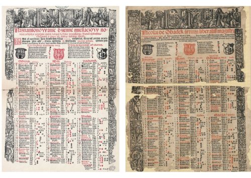
Waste papers preserved between sixteenth-century bindings safeguarded the fragments of Latin- and Polish-language calendars by Nicolaus of Szadek (fig. 2-3). Both calendars, Ephemerides. Anno 1525 and Naznamionowanie dzienne miesiącow nowych pełnych lata 1525, were printed with the use of black and red ink by Hieronimus Vietor in 1524.

Fig. 2-3. Nicolai de Shadek artium liberaliu[m] magistri Cracouien[sis] studij Ephemerides. Anno […] 1525 […] (Cracow: Hieronimus Vietor, 1524). Broadside calendar printed in black and red. Jagiellonian Library, Cracow, shelf-mark Cim. vol. 20. Source: Jagiellonian Digital Library (public domain); Reprint of Naznamionowanie dzienne miesiącow nowych pełnych […] lata […] 1525. [Kraków, Hieronim Wietor, 1524/1525], edited by Wiesław Wydra (Poznań: Wydawnictwo Poznańskie Studia Polonistyczne, 2010). Source: Wielkopolska Digital Library, http://www.wbc.poznan.pl/Content/329994/PDF/index.pdf. The photo presents a reconstruction based on two different fragments of the calendar; a complete copy of this print is not preserved.
Naznamionowanie dzienne and Ephemerides were highly informative and decorative broadsides. They contained detailed astronomical and astrological data (more information was given in the Latin calendar), practical hints concerning the most fortunate time for agricultural works and medical treatments such as bloodletting and cupping. The visual components included biblical scenes (Nativity and the Visit of the Magi), an ornamental frame, heraldic images (coats of arms of Cracow, Polish Kingdom and Gozdawa) as well as calendrical symbols. 

If the reader’s eye followed the red colour in the Polish-language calendar, it first caught the headline explaining that the calendar offers calculations of the days of each month that are convenient for bloodletting, cupping, taking medicines, planting and sowing. The heading indicates practical use of the calendar in medical treatments and common agricultural activities and only briefly mentions the name of the author master Nicolaus of Szadek who must have been well known among Polish readers. His name received a more prominent place in the Latin version of the calendar. Whereas the headline of the calendar begins with the name of the author and builds his authority, the one-word title of the print, Ephemerides (from Greek “ἐφημερίς”, denoting diary or journal), is put at the end of the heading. In the Latin calendar, addressed to the international audience for which numerous other prominent scholars issued their calendars, Nicolaus is introduced as a magister of liberal arts and alumnus of the University of Cracow.  In fact, Nicolaus of Szadek became a professor of astrology in 1515 and eight years later was appointed as the dean of the faculty of philosophy. The readers’ attention is directed to the author’s link to the University, which was renowned for astrological studies from the mid-fifteenth century. On the bequest of Johannes Stobner (1405) a new chair of astronomy was established and it became an obligation of its professor to prepare an annual almanac regarding the movements of the heavenly bodies at the meridian of Cracow (Knoll 2016: 136). After the reform of the Faculty of Arts (1449), the chair funded by Stobner was responsible for teaching arithmetic, music, planetary theory, the Alphonsine tables (i.e. astronomical data, compiled at the court of Alfonso X of Castille for computing the position of the Sun, Moon and planets) as well as for predicting eclipses and updating the almanacs (ibid.). Around 1450 Martinus Rex de Premislia (Polish: Marcin Król), established a new chair in practical astronomy, concentrated mainly on astrology, which along with the previous so-called Stobner chair contributed to elevation of Cracow University to a major centre of astronomical and astrological research in Europe (Knoll: 143). The production of astrological texts also grew significantly. The University’s Statutes of 1476 inform that the professor of the chair of astronomy is expected to write a prediction for the coming year in three different versions: a detailed one for professional use, another prognosticon for representatives of academics constituting the Collegium Maius (this calendar was advised to be delivered to the councilors of Cracow), and last but not least, a prognosis including astrological information addressed to the general audience. By 1520s the tradition of issuing handwritten and later also printed almanacs was well established in Cracow. In fact, the quickly developing print market in Cracow became one of the main hubs of astrological prints production, next to Leipzig and Vienna (Chojecka 1963: 320). 

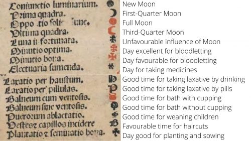
Returning to Nicolaus of Szadek’s calendar, its second red component is the Polish coat of arms. It indicated a quasi-official character of the print and drew the reader’s attention to the legend for 15 (in Latin version, fig. 4) or 14 (in Polish one) highly conventional calendrical symbols, used (with some variations) already in the fifteenth-century calendars (Kusukawa 2011: 99). These small marks, printed in black or red, were used in calendars to inform the reader about the phases of the moon, convenient and excellent times for bloodletting, favorable times for cupping therapy and indications when one should sow, plant or wean children.

Fig. 4. Legend for calendrical symbols in Nicolai de Shadek artium liberaliu[m] magistri Cracouien[sis] studij Ephemerides. Anno […] 1525 […] (Cracow: Hieronimus Vietor, 1524). Fragment of fig. 2.
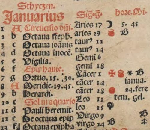
The usefulness of broadside calendars depended mainly on the number, variety and legibility of these symbols. The use of red ink allowed the printer to use the same typographic element to indicate two different aspects, for instance an inauspicious influence of the moon and an excellent time for bloodletting. At the same time names of months, dates of festivals (including Sundays) and astronomical phenomena were printed in red. Red colour also signaled the dominical letter (i.e. a letter from A to G, indicating the days on which Sunday falls. The letters were iteratively assigned to subsequent dates starting from 1 January. In 1525 the dominical letter was A, because Sunday fell on the first day of January. On the basis of the dominical letter and the golden number, informing about the position of the new moon, one could calculate the date of Easter). The calendar for January (fig. 5) has the dates of the feasts of the Circumcision of Christ and Epiphany as well as the day on which the Sun enters the ecliptic of the Aquarius marked in red. The calendrical symbols inform that the 2nd of January was a good day for taking baths with cupping and for cutting hair. If some more complex treatment was needed, it was best to wait until the 7th of January, as this was a day good for bloodletting, baths with cupping and taking medications. 

Fig. 5. January in: Nicolai de Shadek artium liberaliu[m] magistri Cracouien[sis] studij Ephemerides. Anno […] 1525 […] (Cracow: Hieronimus Vietor, 1524). Fragment of fig. 2.
In Wietor’s broadside, as in numerous other broadside calendars, the religious feasts, astrological and astronomical data as well as practical instructions were put next to each other indicating how close God’s macrocosm was linked with the microcosm of the human body and its conditions. The broadside widely disseminated the prognosis, based on advanced astrological calculations, mastered by a few learned scholars (and some charlatans). Thanks to their clear layout and the use of colour they worked as the most basic medical and agronomical manual accessible to a broad and diverse audience, who sought for information that could shape and guide their daily life and experience.  

[expand more_text=”Show more” less_text=”Show less” height=”120″ hide_less=”no” text_color=”#333333″ link_color=”#B26B70″ link_style=”default” link_align=”left”]Quoted literature:

Chojecka, Ewa. 1963. „Krakowska grafika kalendarzowa XVI w.” [Cracow calendar graphic arts in the sixteenth century]. Studia renesansowe 3: 312–482. 

Knoll, Paul W. 2016. “A Pearl of Powerful Learning”: the University of Cracow in the Fifteenth Century. Leiden; Boston: Brill.

Kusukawa, Sachiko. 2011. “Andreas Nolthius’s Almanach for 1575.” Journal for the History of Astronomy 42/1: 91110.

Wydra, Wiesław, ed. 2010. [Mikołaj z Szadka, Naznamionowanie dzienne miesiącow nowych pełnych lata 1520?. Kraków, Hieronim Wietor, 1519/1520]. Poznań: Wydawnictwo Poznańskie Studia Polonistyczne. http://www.wbc.poznan.pl/Content/328923/PDF/index.pdf.

[/expand]

Who Illuminated Incunabula in Cracow in the late Fifteenth Century?

Until the beginning of the fifteenth century illuminating manuscripts in the Kingdom of Poland, as elsewhere in Europe, was the domain of clergy. Over the century this specialty went beyond cloisters and started to be also an occupation of laymen. In the late fifteenth century Cracow was the main centre of illumination production in the Kingdom. This period seems to be crucial due to the changes caused by the invention and development of the printing press. It enabled shorter, wider and cheaper book production and, at the same time, a high demand for printed books, not only liturgical ones, but also these which served educational purposes. Consequently, new groups of craftsmen, who bound and decorated books, appeared.

During the fifteenth century, the boundaries between different specializations of artisans were still not very clear. Sometimes a cathedralis, whose main task was to write a book, was simultaneously a bookbinder and illuminator (Lewicka-Kamińska 1972: 50). This tradition seems to be continued till the end of the century. Those who bound books were often also the authors of the decorations. Therefore, knowledge about the bookbinders of that period can be helpful in the research on illuminators.

It is estimated that about 30 bookbinders were active in the fifteenth-century Cracow. They worked in scriptoria at Wawel for the cathedral and for the royal court, but also at the University (Lewicka-Kamińska 2015: 406). Presumably, the situation of illuminators was similar. The phenomenon of layman bookbinders, and probably illuminators, was closely connected with the appearance of private and institutional libraries. The academic centres, such as Cracow, were great markets because of the need for educational books. At the University of Cracow, as in other European centres, students, both bachelors and masters, worked as bookbinders. They collected the most necessary tools in their dormitories where they worked (Lewicka-Kamińska 2015: 400).

The knowledge of the representatives of this group is still insufficient. Among many anonymous book’ decorators, two names emerged: Valentinus of Pilzno and Jakub Jeżowski. Valentinus started his studies at the University of Cracow in 1474, got his Bachelor’s degree (baccalaureus) in 1477 and Master’s degree (magister) in 1479. He was an active bookbinder and illuminator till his death in 1486. Anna Lewicka-Kamińska called him the most talented Cracovian bookbinder of this period, whose workshop existed till the end of the fifteenth century. The author claimed that Valentinus must have had assistants of great abilities due to the equal technical and artistic level of the workshop’s production (Lewicka-Kamińska 1974: 265). This assumption can be confirmed by the statement that the bookbinders did not work alone, but were supported by their colleagues or even had their own workshops where the tasks were divided; hence, decorations in one book could be made by different hands (Miodońska 1993: 98-99).

Valentinus’ activity was connected closely with the University because he bound and decorated his colleagues’ and professors’ books. One of them was Andrzej of Łabiszyn (d. 1498), the professor of canon law and theology and the rector of the University. Eight of incunabula which belonged to him were bound and decorated by Valentinus (today in the Jagiellonian Library: Inc. 550-551, Inc. 669, Inc. 829,  Inc. 1047, Inc. 1106, Inc. 1163, Inc. 1241, Inc. 1879; Szelińska 1966, 147-151; Lewicka-Kamińska 1974: 266; Wagner 2016: 120). He donated three manuscripts and twenty three incunabula to the Library of Collegium Maius, today’s Jagiellonian Library (Zathey, Lewicka-Kamińska, Hajdukiewicz 1966: 125).

Due to his activity as a bookbinder and illuminator Valentinus must have known the technical processes of making a book from different angles. Moreover, he was thought to be a bibliophile, who gathered books which were decorated and bound in his own workshop. Two examples preserved in the Jagiellonian Library are known: Avicenna’s Canon medicinae (shelf-mark Inc. 669), donated to the University by the owner and Margarita poetica by Albertus de Eyb (shelf-mark Inc. 446) which was provided with an inscription: Valentini liber (Lewicka-Kamińska 1974: 271).

The artisan’s name appeared also in another copy of Canon medicinae kept in the Jagiellonian Library (shelf-mark Inc. 670). Inscription on page 471, written in red lead, reads: Per Valentinum illuminatum, magistrum arcium cum stetit in bursa Hierusalem per sex dies tempore quadragesimali Anno domini 1480 et introligatus per eundem in C[racovia]. This very rare case of signing work by Cracow illuminator gives us a lot of evidence; it proves the double role of Valentinus (illuminator and bookbinder), the date (six days, during Lent in 1480) and place of creating the book as well as the existence of a scriptorium at the University of Cracow where books were written, decorated and bound by students (Ameisenowa 1958: 135). This workshop could have been located in Jerusalem dormitory, mentioned in the inscription, at Gołębia street. In 1910, nearby this place, an impressive collection of bookbinders’ stamps, dated to the fifteenth and sixteenth century, was found (Lewicka-Kamińska 1974: 270-271).

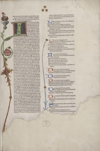
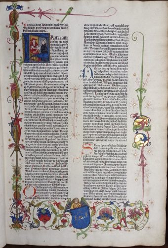
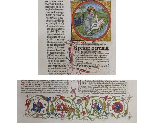
Fig. 1. Illuminated page of Avicenna, Canon medicinae. De viribus cordis (Padua: Petrus Rochabonellus, Mutius Prosdocimus, 1476), fol. a2, painted by Valentinus of Pilzno (?) in Cracow, c. 1480, Jagiellonian Library, Cracow, shelf-mark Inc. 670. Source: Jagiellonian Digital Library (public domain).

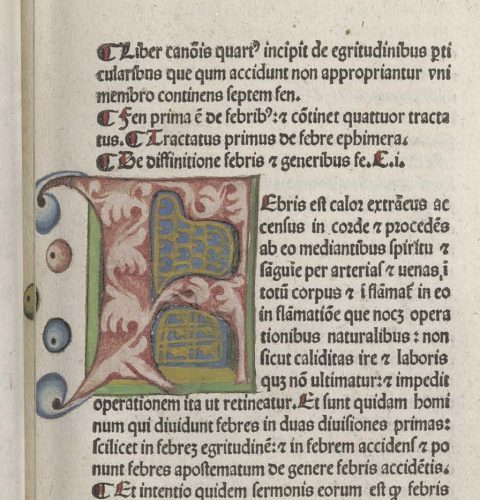
The printed text of Canon medicinae was filled in with many blue and red letters, simple in form, but at a high technical level. Initial I was composed of green acanthus leaves on a black background and closed in a pink frame. The letter was accompanied by the bust of a man in a red hat, sitting on a grey console. Ameisenowa noticed the realistic way of representing the figure’s face (Ameisenowa 1958: 135). The repetitive motive in Valentinus’ works were the three beads located on the margin. In this case they were painted in gold (fig. 1), whereas in another copy of Canon medicinae, next to initial F, pink, green and blue paints were used (fig. 2).

Fig. 2. Avicenna, Canon medicinae (Padua: Johann Herbort, 1479), fol. a1, illuminated initial F, painted by Valentinus of Pilzno (?) in Cracow, c. 1480, Jagiellonian Library, Cracow, shelf-mark Inc. 669. Source: Jagiellonian Digital Library (public domain).

According to Ameisenowa, one of the earliest incunabula decorated by Valentinus was the example of Catholicon by Johannes Balbus de Janua held in the Jagiellonian Library in Cracow. It was printed in Mainz in 1460. The initials and margins ornaments, made by Valentinus, represented typical stylistic features of his work. The letters were composed of soft acanthus leaves or, rarely, interlocking plants, while their inner side was filled in with yellow or golden zigzag pattern or diagonal lattice (fig. 3). Another characteristic feature was the use of minium as well as painting the initials in red and azure. The ornaments on margins consisted of long acanthus-like leaves which ended with long foliated scrolls. The wide range of colours used in this example included brown, azure, light blue, carmine, scarlet, maroon, two different hues of green and grey as well as gold, both liquid and golden leaf.

Fig. 3. Illuminated page of Johannes Balbus de Janua, Catholicon (Mainz: Johannes Guttenberg (?), 1460), fol. a2, initials and margins decorations painted by Valentinus of Pilzno (?) in Cracow, c. 1475, Jagiellonian Library, Cracow, shelf-mark Inc. 1011. Source: Jagiellonian Digital Library (public domain).

It seems that Valentinus was better in writing initials and rubrics than in painting ornaments or miniatures. An example of his more complex work was the one which belonged to the aforementioned example of Canon medicinae. It depicts Avicenna at an ill man’s bed, surrounded by seven other figures (fig. 4). A simple composition was enclosed in a green frame while people were distinguished by colourful robes. Valentinus’ illuminations were described as rather conservative and not diversified, especially in comparison with some other anonymous Cracovian decorations made in the 1480s or the ones created by Jakub Jeżowski.

Fig. 4. Valentinus of Pilzno, Avicenna at ill men’s bed, miniature, Cracow, c. 1479-1480, Jagiellonian Library, I.R. 41. Source: Jagiellonian Digital Library (public domain).

Jakub Jeżowski was a nobleman, the son of Stanisław of Jeżów, a student of the Cracovian Academy, illuminator, bookbinder and cathedral psalmist. Similarly to Valentinus, Jeżowski bound and decorated incunabula for the Academy’s professors. It was evidenced that he worked at least for three years for Piotr Świętopełk of Zembrzyce, professor of theology (d. 1497; Miodońska 1967: 107). He was a donor of 3 manuscripts and 202 incunabula to the Collegium Maius Library (Zathey, Lewicka-Kamińska, Hajdukiewicz 1966: 125).

Fig. 5. Illuminated page of Biblia Latina (Basel, c. 1480), fol. a1, initials and margins decorations painted by Jakub Jeżowski (?) in Cracow, c. 1484-1488, Jagiellonian Library, shelf-mark Inc. 1734. Source: by courtesy of the Early Printed Books collection of the Jagiellonian Library.

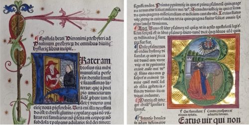
Decorations in the copy of the first part of Biblia Latina were ascribed to Jeżowski on the basis of the monogram .I. .I., visible on the coat of arms (fig. 5). In turn, the illuminations in the copy of the second part of Biblia Latina were attributed to him on the basis of stylistic features. In both examples the ornamentation was developed more than in Valentinus’ works. The main difference was the complex composition. Some initials were filled with the scenes, for example: initial F with Saint Jerome or initial B with David with a harp (fig. 6). Furthermore, purely decorative elements, such as a medallion with Creating of Eve as well as birds, human figures or an angel, entangled in the floral motives on the margins, appeared (fig. 7).

Fig. 6. Left: Biblia Latina, pars I (Basel, c. 1480), fol. a1, initial F and margins decorations painted by Jakub Jeżowski (?) in Cracow, c. 1484-1488, Jagiellonian Library, shelf-mark Inc. 1734, fol. a1. Right: Biblia Latina, pars II (Basel, c. 1480), fol. e1, initial B painted by Jakub Jeżowski (?) in Cracow, c. 1484-1488, Jagiellonian Library, shelf-mark Inc. 754. Source: by courtesy of the Early Printed Books collection of the Jagiellonian Library.
Fig. 7. Biblia Latina, pars I (Basel, c. 1480), fol. a5, decorative medallion (top) and margin decorations (bottom) painted by Jakub Jeżowski (?) in Cracow, c. 1484-1488, Jagiellonian Library, shelf-mark Inc. 1734. Source: by courtesy of the Early Printed Books collection of the Jagiellonian Library.

Among many anonymous authors of illuminations, Valentinus of Pilzno and Jakub Jeżowski were two documented names of incunabula illuminators, who worked for the community of the University of Cracow in the late fifteenth century. The ornaments which they produced represented various styles and different levels of development; nevertheless, they continued earlier tradition of manuscript decorations, characteristic for this region and time. Illuminations made in Cracow by this generation of craftsmen had a distinct influence on the style of incunabula decorations created in the first half of the sixteenth century.


Quoted literature:

Ameisenowa, Zofia, 1958. Rękopisy i pierwodruki iluminowane Biblioteki Jagiellońskiej [The manuscripts and illuminated incunabula in the Jagiellonian Library], Wrocław – Kraków: Zakład Narodowy im. Ossolińskich.

Lewicka-Kamińska, Anna, 1972. „Rzut oka na rozwój oprawy książkowej w Polsce” [The development of the bookbinding in Poland]. Roczniki Biblioteczne, vol. 16, Wrocław: Państwowe Wydawnictwo Naukowe, pp. 49-68.

Lewicka-Kamińska, Anna, 1974. “Walenty Lis z Pilzna, introligator krakowski XV wieku” [Valentinus of Pilzno, Cracovian book-binder of the fifteenth century]. Roczniki Biblioteczne, vol. 18/1-2, pp. 265-273.

Lewicka-Kamińska, Anna, 2015. “Dzieje rzemiosła introligatorskiego” [The history of the craft of bookbinding], edited by Jacek Patryka. Terminus, vol. 17 (2015), n. 3 (34), Kraków: Biblioteka Jagiellońska, pp. 387-420.

Miodońska, Barbara, 1967. Iluminacje krakowskich rękopisów z I połowy w. XV w Archiwum Kapituły Metropolitalnej na Wawelu [The illuminations of the Cracow manuscripts of the first half of the 15th century in the Archives of the Cracow Cathedral Chapter], Kraków: Ministerstwo Kultury i Sztuki, Zarząd Muzeów i Ochrony Zabytków.

Miodońska, Barbara, 1993. Małopolskie malarstwo książkowe: 1320-1540 [Illuminated books in Małopolska], Warszawa: Wydawnictwo Naukowe PWN.

Szelińska, Wacława, 1966. Biblioteki profesorów Uniwersytetu Krakowskiego w XV i początkach XVI wieku [The libraries of the professors of the University in Cracow in the 15th and 16th century], Wrocław: Zakład Narodowy im. Ossolińskich.

Wagner, Arkadiusz, 2016. Superekslibris polski: studium o kulturze bibliofilskiej i sztuce od średniowiecza do połowy XVII wieku [The Polish supralibros. The study on bibliophile culture and art from Medieval Ages up to the mid-17th century], Toruń: Wydawnictwo Naukowe Uniwersytetu Mikołaja Kopernika.

Zathey Jerzy, Lewicka-Kamińska Anna, Hajdukiewicz Leszek, 1966. Historia Biblioteki Jagiellońskiej [The history of the Jagiellonian Library], vol. 1, Kraków: Uniwersytet Jagielloński.

Ruber in Rubricellae: Bishops’ Coats of Arms in Cracow Liturgical Calendars Printed by Łazarz Andrysowic

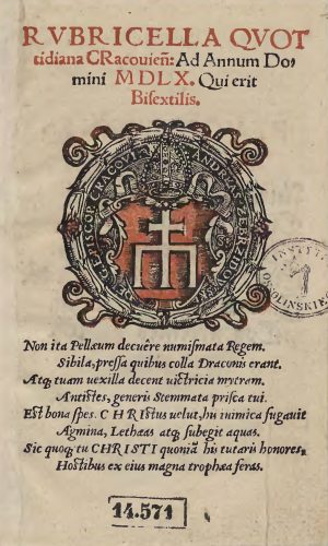
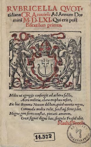
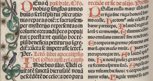
The Latin words ruber and rubrica refer to red ink and a title, chapter or paragraph which was marked with red ink in handwritten books. The term for the liturgical calendar, rubricella, clearly signalized the importance of red colour for this type of calendar. In medieval Latin rubricella meant simply a small rubrica. Red marked Sundays and all important festive days firstly in the handwritten calendars and afterwards also in the printed ones. Apart from highlighting holidays, red ink was also used to print the title of the calendar and, in the case of Łazarz Andrysowic’s prints of 1549–1570, also the bishop’s coat of arms on the rubricella’s title page.

Polish handwritten rubricellae are known only from historical records. The earliest preserved liturgical calendar is Rubricella Cracoviensis ad annum 1507 printed in Cracow by Johannes Haller. Because of their intensive use within a limited time only a small percentage of the calendars’ copies survived to the present day. Yet, the demand for rubricellae was very high. Every parish needed a list of liturgies, fasts and festive days to guide clergymen through the forms of Divine Office, Holy Mass and other liturgies to be said each day from the 1st January to the 31st December. As each diocese had its own set of festive days as well as celebrating universal ones, such as for instance Easter, which was a moveable feast, dioceses needed a new liturgical calendar each year. Moreover, most of the sixteenth-century rubricellae consists of only 2 up to 16 pages, which made them quick and cheap to print. Because the production of the liturgical calendars was a lucrative and relatively low-cost business, the Cracow printers endeavoured to get such commissions and special printing privileges from the local bishops (Juda 1992: 56). 

After the Rubricella for 1507, several subsequent liturgical calendars printed by Johannes Haller, Florian Ungler and Hieronimus Vietor are known. After Vietor’s death, the profitable business of printing rubricellae was continued by his widow and then by her new husband Łazarz Andrysowic. By this time liturgical calendars already had their fixed visual form. The title of the calendar was generally printed partly or entirely in red. The coat of arms of the bishop, or in the rare cases that of the diocese, was printed below the title. Most commonly it was placed in a wreath and often followed by stemma, a short heraldic poem. Andrysowic’s contribution was the introduction of printed colour to the bishops’ coats of arms.

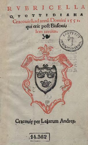
The earliest of Łazarz Andrysowic’s red-and-black woodcuts was rather basic. It was a heraldic composition on the title page of his Rubricella quottidiana Cracovien[sis] ad annu[m] Domini 1551…. (fig. 1), printed just two years after Andrysowic as an apprentice entered the printing shop of Barbara Vietor. 

Fig. 1. Title page of Rubricella quottidiana Cracovien[sis] ad annu[m] Domini 1551 qui erit post Bissextilem tertius (Cracow: Łazarz Andrysowic, 1550), Ossoliński National Institute, shelfmark XVI.O.1063. Source: Lower Silesian Digital Library (public domain).
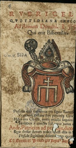
On the title page of Rubricella quottidiana three lines of the calendar’s title and a cartouche were printed in red. The black ink was used to print the coat of arms of the Cracow diocese, leaving two lines of the title – a leaf-shaped typographic ornament, and the place of printing along with the name of the printer – to be printed in a separate run through the press. Andrysowic played it safe and used two colours which did not overlap. In the following year the printer began to explore the possibilities of colour printing and he achieved much better integration of two colours in his next edition of Rubricella quottidiana for 1552 (fig. 2).

Fig. 2. Title page of Rubricella quottidiana Cracoviensis ad annum 1552 bissextilem (Cracow: Łazarz Andrysowic, 1551), The Kórnik Library of the Polish Academy of Sciences, shelfmark Cim.O.527a. Source: Digital Library of Greater Poland (public domain).

Andrysowic used red to print the cartouche of the Radwan coat of arms of Andrzej Zebrzydowski (bishop of Cracow in 1551–1560), which was in accord with the heraldic colours of the Radwan. The inside parts of two lapets and the mitre along with jewels embellishing it were also printed in red. This created very decorative effects, characteristic also for Andrysowic’s later colour prints.

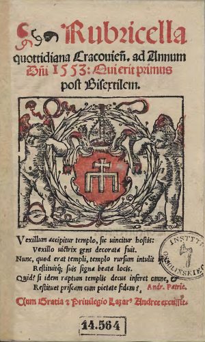
The elegant, clear and coherent heraldic composition was replaced by an even more decorative image in the following year. In 1552 Andrysowic placed Zebrzydowski’s coat of arms within a wreath held by two putti, modifying  Vietor’s earlier woodblock (fig. 3).

Fig. 3. Title page of Rubricella quottidiana Cracovien[sis] ad annum D[omi]ni 1553 Qui erit primus post Bisextilem (Cracow: Łazarz Andrysowic, 1552), Ossoliński National Institute, shelfmark XVI.O.1064. Source: Lower Silesian Digital Library (public domain).
The use of red, apart from its appearance in the coat of arms,  has mainly decorative functions and one can wonder if the printer did not push it too far by filling the putti wings with red colour. He must have been content with the effects as he impressed the same two woodblocks in six subsequent editions of Rubricella quottidiana until 1558.

In 1559 he changed the composition again and arrived at a very elegant and medal-like image that might have pleased humanistic-minded viewers (fig. 4). Red complied with the heraldic colours of the coat of arms and, apart from the cartouche, was moderately and accurately used to colour the ribbons and flowers on the wreath. 

Fig. 4. Title page of Rubricella quottidiana Cracovien[sis] ad annum Domini M D L X. Qui erit Bisextilis (Cracow: Łazarz Andrysowic, 1559), Ossoliński National Institute, shelfmark XVI.O.1070. Source: Lower Silesian Digital Library (public domain).
Yet, Zebrzydowski died in 1560 and Andrysowic needed to introduce the coat of arms of Filip Padniewski (bishop of Cracow in 1560-1572) onto the title page of the subsequent Rubricella quottidiana. The problem was that Padniewski’s coat of arms had no red. His Nowina consists of a silver cauldron’s handle with both ends upwards and a sword between them, all placed within a blue shield. Blue ink, because of the high price of the pigment, was extremely rare in sixteenth-century Polish prints, so Andrysowic had to come up with another solution. He reworked the line woodblock used already in Rubricellae quottidianae printed between 1552 and 1558 and replaced the Radwan coat of arms with the Nowina. He also had a new block made to print the red colour, which he used to decorate the contour of the coat of arms, the mitre and ribbons (fig. 5).

Fig. 5. Title page of Rubricella quottidiana Cracovien[sis] ad annum Domini M.D.LXI. Qui erit post Bisextilem primus (Cracow: Łazarz Andrysowic, 1560), Ossoliński National Institute, shelfmark XVI.O.1080. Source: Lower Silesian Digital Library (public domain).
Luckily, this time he abandoned the idea of printing the angels’ wings in red. The same matrices were reprinted on the subsequent Cracow rubricellae until 1569. In the same period red-and-black coats of arms of clergymen also made their appearance in other prints by Andrysowic. For instance, the title page of Epitome totius Veteris et Novi Testamenti carmine elegiaco conscripta (Cracow, 1561) with the red-and-black Trzaska coat of arms of the abbot of the Benedictine monastery in Lubiń, Paweł Chojnacki, had a similar composition to Rubricellae quottidianae. In turn, Catechismus elementa pietatis Christianae (Cracow 1561) has the Półkozic coat of arms of the bishop of Chełm, Mikołaj Wolski, printed in red and black ink on the verso of the title page.

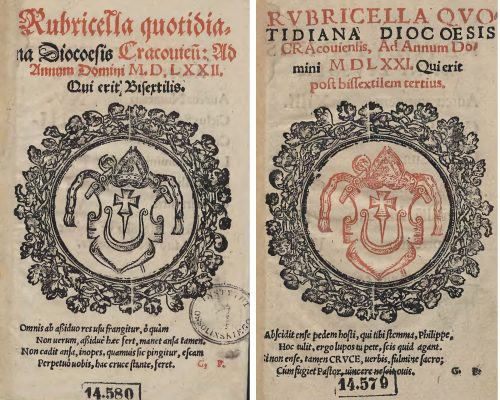
It was not easy for other Cracow printers to emulate the use of the red-and-black coat of arms introduced by Andrysowic. Matthaeus Siebeneicher, who took over the printing of Cracow liturgical calendars in 1570, initially attempted to print Filip Padniewski’s coat of arms in red (fig. 6), even though this has no basis in the heraldic tradition. He started the same way Andrysowic did in 1550, namely avoided overlap of colours and printed the coat of arms and the wreath from two separate woodblocks. Yet, already in the second edition of his Cracow rubricella he gave up on the idea and limited himself to a black-and-white heraldic composition (fig. 7).

Fig. 6-7. Title pages of Rubricella quotidiana diocoesis Cracoviensis ad annum Domini MDLXXI. Qui erit post bissextilem tertius (Cracow: Matthaeus Siebeneicher, 1570), shelfmark XVI.O.1074, and Rubricella quotidiana diocoesis Cracovien[sis] ad annum Domini MDLXXII. Qui erit post bissextilem tertius (Cracow: Matthaeus Siebeneicher, 1571), shelfmark XVI.O.1073, both from Ossoliński National Institute. Source: Lower Silesian Digital Library (public domain).
Apart from Rubricella Quotidiana for 1572 no other Siebeneicher attempts to print images in colour are known. Łazarz Andrysowic’s experiments with ruber in Cracow rubricellae remain exceptional, if not extravagant, in the sixteenth-century Polish print market.

Quoted literature:

Juda, Maria, 1992. Przywileje drukarskie w Polsce [The privileges of printers in Poland], Lublin: Agencja Wydawniczo-Handlowa AD.

Distinguished by Colour: Initials in two Copies of Missale Cracoviense (1515/1516)

The early printed missals were dominated by two colours: black and red. This diversification of type colour played a practical role and was used already in the manuscripts. At the beginning the printing of both colours simultaneously was more expensive and complicated technically because it demanded the separate printing of each colour. Therefore, sometimes in the early incunabula the blank spaces were left and filled in with red text manually (Ikeda 2015: 65; König 2018: 267). These red fragments, called rubrics from the Latin ruber (red), described the commentaries and remarks for priests which were not supposed to be read to the faithful. Nigrics, from the Latin niger (black) were the prayers in black which should be read during the service (King 1957: 181-182). It is interesting that it was red, the more visible colour, which signalled the silent parts.

However, the use of colour was not only limited to the printed text. Hand-colouring was the main method of decorating woodcuts such as whole-page images and initials. Sometimes,  colour was used to emphasise the most important parts of the liturgy or prayers. The variety of initials as well as their modifications can be discussed on the example of two copies of Missale Cracoviense printed c. 1515/1516 by Johannes Haller in Cracow. The copy with no manual colouring is preserved in the Kórnik Library of the Polish Academy of Sciences (shelf-mark Cim.F.4107) while the illuminated copy is held in the Ossoliński National Institute in Wrocław (shelf-mark XVI.F.4053).

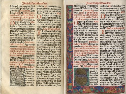
Fig. 1. Red printed initials and floral bordure in: Missale Cracoviense, 1515/1516 (Cracow: Johannes Haller), Ossoliński National Institute, Wrocław, shelf-mark XVI.F.4053, hereafter referred as copy A, fol. y2v. Source: Lower Silesian Digital Library (public domain).

These two liturgical books included few kinds of initials, differentiated by size and ornamentation. The first group was the same in both copies. It consisted of very simple, slightly bigger, two-line letters, printed in red (fig. 1, fig. 2). In most cases they marked the beginning of the paragraphs.

Fig. 2. Red printed initials in: Missale Cracoviense, 1515/1516 (Cracow: Johannes Haller), Kórnik Library of the Polish Academy of Sciences, shelf-mark Cim.F.4107, hereafter referred as copy B, fol. y2v. Source: Wielkopolska Digital Library (public domain).

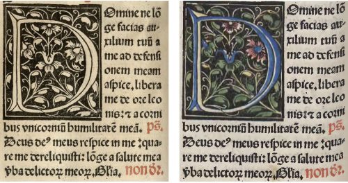
The rest of the initials were black and white woodcuts, coloured manually in the case of the copy held in Ossolineum. Three-line initials were the second and the most considerable group (fig. 3). The letters were inscribed in a square while the background was filled with various floral motives. In the illuminated copy the majority of initials was painted by hand according to the scheme: a monochromatic letter and another or few other hues for the ornament.

Fig. 3. Initial H in: Missale Cracoviense, 1515/1516, fol. b1v: copy B (left), copy A (right).

Similar in form, but much bigger, were six- and eight-line initials, consisted of letters entangled in flowers, tendrils or geometrical shapes (fig. 4). In the illuminated copy one or two colours were used to decorate the letter and few others to paint the rest of the motives.

Fig. 4. Initial D in: Missale Cracoviense, 1515/1516, fol. r6v: copy B (left), copy A (right).

 In each of these cases the letters and other elements remained visible, the only change was the addition of colours. Nevertheless, significant changes appeared in the group of the biggest and the most elegant initials. In the uncoloured copy of the missal one can see figural initials, scenes which were connected directly to the proper part of liturgy, for example: the Nativity, the Magi, the Resurrection, the Assumption of Mary or the Trinity. In the colourful copy these scenes were painted so thoroughly that they were not visible (fig. 5). Woodcuts disappeared under a thick layer of paint. It covered the fleshy floral contours of the letters completely, while the spaces inside the letters were filled with gold. Maroon, red, blue, green and violet dominated this decoration. Presumably, such dark hues were used in order to cover the lines of the composition better.

Fig. 5. Initial E in: Missale Cracoviense, 1515/1516, fol. c3r: copy B (left), copy A (right).

These carefully designed hand-painted decorative elements were complemented with an exquisitely illuminated bordure made of floral and architectural ornaments. Such decorations on margins appeared only in combination with the most elegant initials, so they were meant to emphasise the indicated part of the text. The first page following the calendar part was decorated with an initial A and a bordure with vases and floral motives such as flowers, tendrils and leaves (fig. 6).

Fig. 6. Missale Cracoviense, 1515/1516, fol. a1r, copy B (left), copy A (right).

A distinctive element in the bottom left corner of the page was the Prus coats of arms in a wreath. The name written on the shield (Joannes Schikowsky) referred directly to the alleged owner of this exemplar, Johannes Szykowski (d. 1535), a clergyman, related to the cathedral in Cracow and the parish priest of Gnojno. A specific and local floral motif, which appeared on another page, twigs, leaves and flowers of carnation, was recognized as another feature which led to the same person. This characteristic element was connected with the ex-libris of Johannes Szykowski with four carnations flanking the composition (Gruczyński 1967: 57). Unfortunately, the original location of the bookplate is unknown. Zofia Ameisenowa made an assumption that it was made in the woodcut workshop working for the Cracow printer Florian Ungler c. 1530 (Ameisenowa 1947: 14-15; the connection between the two bookplates, the woodcut and the painted one, was, however, partially undermined by Anna Lewicka-Kamińska (1970: 143-146)).

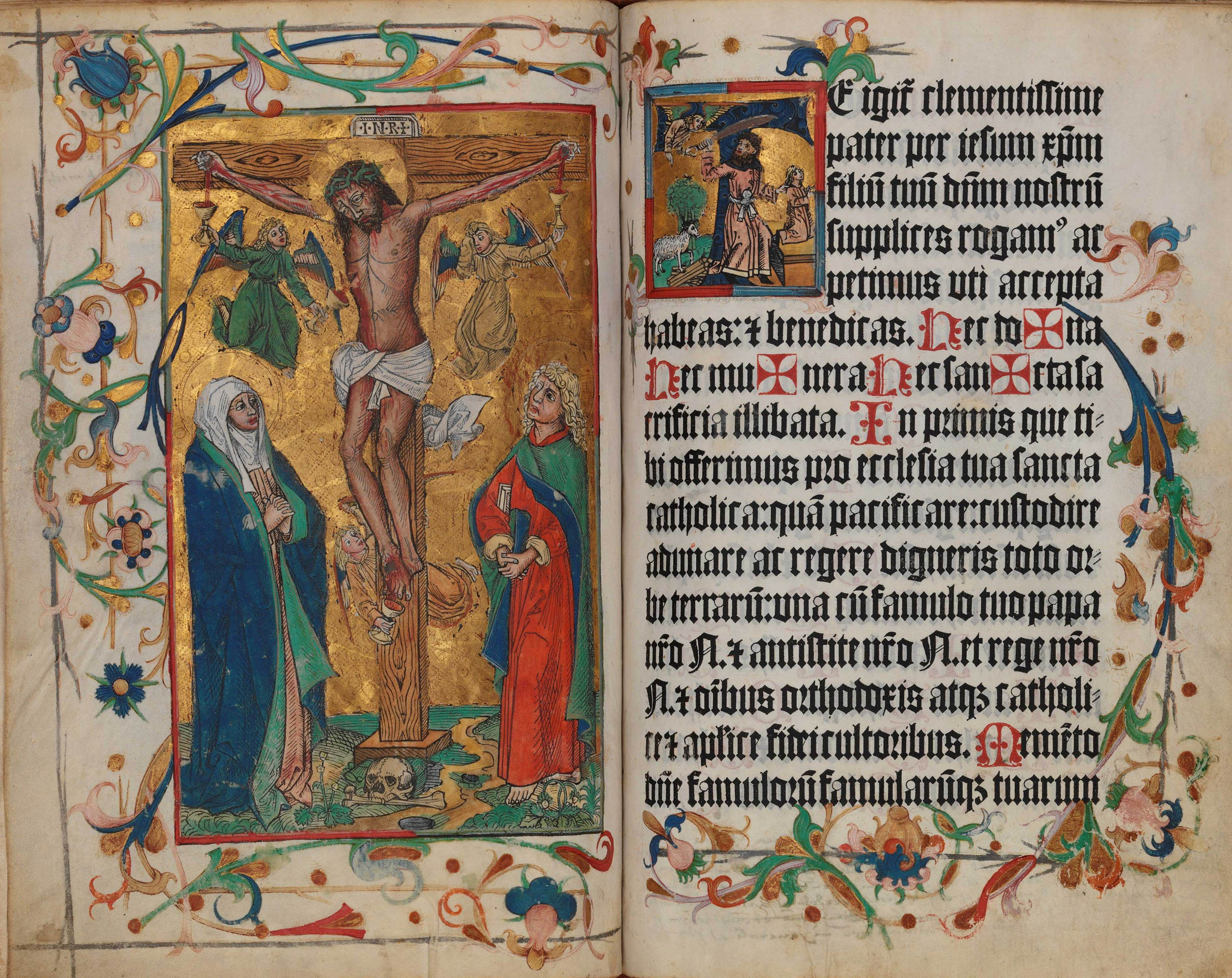
The floral bordure, which surrounded the text from three sides, occurred also on the first page of the Canon in the illuminated copy of the book. This special part of the missal, printed on the parchment and containing the most important liturgical prayer, begins with the words “Te igitur”, starting with the letter T. Its shape was associated with the cross and, therefore, in many cases it was decorated in an exceptional way. In this copy of Missale Cracoviense it was the five-line initial with a figurative scene, the only one in the whole book which had not been painted over. It represented the sacrifice of Isaac, which, within this context, referred directly to the sacrifice of Christ as God’s only Son (fig. 7).

Fig. 7. Initial T in: Missale Cracoviense, 1515/1516, fol. a2r, copy A.

The Canon part was preceded by the whole-page woodcut depicting Crucifixion. It is worth noticing that its colours referred to other elements of decoration. First of all, the hues resembled the ones used in the biggest initials with gold. Second of all, the double frame of the woodcut corresponded to the figural initial on the adjacent page. Red used in the inner frame and grey used in the outer frame were repeated in the initial. This colour scheme brings the two images even closer to each other and suggests a direct connection between the meaning of these two scenes. Unfortunately, the copy held in Kórnik lacks the Canon part, which prevents further comparisons and conclusions.

An elegant and refined decoration of illuminated copy of the Missale Cracoviense consisted of five kinds of colourful initials, coloured Crucifixion and a subtle ornamental bordure. Covering the figural initials with paint so thoroughly that they were invisible can be an evidence of a strong attachment to the medieval way of perceiving a book. The owner of the illuminated copy must have been a bibliophile, for whom the colour added manually to the printed book had a special artistic and aesthetic value. Yet, the illuminations which he had commissioned did not respect the original iconographic programme of the book. The original meaning and function of the most significant initials have been lost in the illuminated copy of the Missale (fig. 8). By means of colour the illuminator has interpreted the iconography of the missal and, at the same time, created, in fact, a new work of art.

Fig. 8. Missale Cracoviense, 1515/1516, fol. q3v: copy B (left), copy A (right).

Quoted literature:

Ameisenowa, Zofia 1947. Dwa nieznane polskie znaki książkowe z XVI wieku [Two unknown Polish sixteenth-century bookplates]. Kraków: Towarzystwo Miłośników Książki.

Gruczyński, Stanisław, 1967. “Ekslibris Jana Szykowskiego” [Jan Szykowski’s bookplate]. Roczniki Biblioteczne, vol. 11, no. 1/2: pp. 55-61.

Ikeda, Mayumi, 2015. “The Fust and Schöffer Office and the Printing of the Two-Colour Initials in the 1457 Mainz Psalter”. In Printing Colour 1400-1700, edited by Ad Stijnman and Elizabeth Savage, pp. 65-75. Leiden, Boston: Brill.

Kawecka-Gryczowa, Alodia, 1983. “Haller Jan.” In Drukarze dawnej Polski, pp. 44-62.

King, Archdale A., 1957. “Rubrics”. In: Liturgy of the Roman Church, pp. 181-183. London: Longmans.

König, Eberhard 2018. “Colour for the Black Art”. In Painting the Page in the Age of Print: Central European Manuscript Illumination of the Fifteenth Century, edited by Jeffrey F. Hamburger, Robert Suckale, Gude Suckale-Redlefsen, translated by David Sánchez, pp. 265-290. Toronto: Pontifical Institute of Mediaeval Studies.

Lewicka-Kamińska, Anna 1970. “Ekslibris Anonima herbu Prus I” [The bookplate of the Anonim of the Prus coat of arms I]. Biuletyn Biblioteki Jagiellońskiej, vol. 20, no. 1/2: pp. 141–146, il. 12.

Heraldic Red in Printed Coat of Arms: The Case of the Sigismundian Eagle (1524)

If an image was printed in colour, it was generally printed in red. If it was printed in sixteenth-century Poland, it was most commonly the Polish coat of arms, namely the White Eagle with a crown, in a red shield. Typically the heraldic eagle in the red shield appeared in the title pages of official documents, mainly constitutions promulgated by the Polish Parliament. The earliest known example is the so-called Sigismundian Eagle, that is the heraldic eagle with the monogram of the king Sigismund I (1507–1548), printed from two woodblocks in register in the first three editions of the Statuta serenissimi domini Sigismundi Primi Poloniae Regis (edition A of 1524, edition B printed before the end of 1531 and C before 1538), a collection of constitutions from 1507–1523, released by Hieronymus Vietor (and after his death by his wife Barbara) at least eleven times between 1524 and around 1550 (Piekarski, 1929).

Red was at the top of the hierarchy of heraldic colours. As pertinent to popes, emperors and kings, it was the most frequently used colour in medieval coats of arms (Pastoureau 2017: 74). Its practical value, the fact of its easy discernibility to the human eye, further justifies the popularity of red in heraldry. It was the visibility of red that caused its frequent use in the identification devices on the battlefield, from which the coat of arms originates. Likewise, the heraldic symbolism of red referred to bravery and gallantry (Kuczyński 1978: 93). Perhaps it was in these meanings that red appeared on the battle standards of the Polish dukes from the Piast dynasty. As heraldic colours were absolute and conceptual, their shades did not matter (Pastoureau 2017: 74). This eased the work of the printers, who used the same red ink to print texts and coats of arms, as was the case of Hieronymus Vietor.

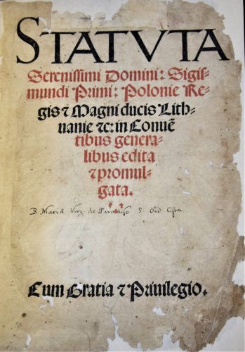
Fig. 1. Title page of Statuta serenissimi domini Sigismundi Primi Poloniae Regis (Cracow: Hieronymus Vietor, 1524), title of Statuta printed in red and black, National Library in Warsaw, shelf-mark SD XVI.F.1016. Photo by Karolina Mroziewicz.

The A, B and C editions of Statuta had six lines of the title and three small crosses on the title page printed in red (fig.1). The same ink was used to impress the red shield on the verso of the title page (fig.2).

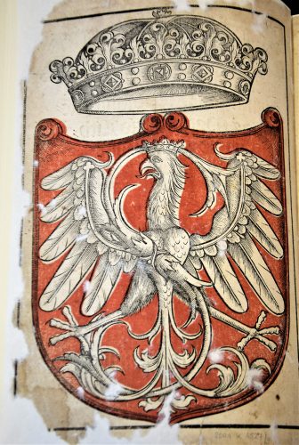
Fig 2. The Sigismundian Eagle on the verso of the title page of Statuta serenissimi domini Sigismundi Primi Poloniae Regis (Cracow: Hieronymus Vietor, 1524), heraldic image printed from two woodblocks in red and black in register, National Library in Warsaw, shelf-mark SD XVI.F.1016. Photo by Karolina Mroziewicz.

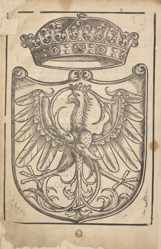
Even though the colour woodcut came out of the press of a renowned printing house, its technical awkwardness demonstrates the main difficulties which even an experienced printer had to face when impressing a colour coat of arms. The first challenge was to register the two blocks in relation to one another. This was not fully successful in Statuta as the red colour goes over the parts of the image which should remain white and obscures the black contour (fig.2). The second problem was the consistency of the red ink. In several studied impressions the ink seeped through the title paper and left a stain on the eagle head. Sometimes the red dots of ink used on the verso of the page are clearly visible on the title page and build up a contour of the Eagle’s wings (as for instance in the copy of Statuta held in the collection of the Princes’ Czartoryski Library/National Museum in Cracow, shelf-mark 29 III Cim). The penetration of the ink through the page suggests that the ink recipe needed improvement. Perhaps these technical complications discouraged Vietor from printing colour in the subsequent editions. Certainly, it was not the deterioration of the woodblock used to impress colour, as it was still in decent shape in the C edition. The line blocks were generally impressed in Vietor’s Statuta as long as possible, regardless of their poor physical shape (cf. fig.3). Even though the colour might have drawn attention away from the faults of the woodblock, it was not considered to be an easy option.

The Sigismundian Eagle with the closed crown (Latin corona clausa) above its head, printed by Vietor, is a combination of the state coats of arms with the monogram of the current king and the symbol of the sovereignty of his power. The closed crown was a characteristic imperial regalia and was used in the iconography of the last Jagiellon rulers in Poland to manifest the idea of the king being an emperor in his own kingdom (according to the Latin phrase rex imperator in regno suo). This mixture of state, royal and personal symbols was unusual in European heraldry. As Mieczysław Morka claims, it was more common to link the ruler’s initials with another emblem in the cases when one intended to stress a feudal dependency between the ruler and a particular territory (Morka 2006: 323). Morka suggests that the close interplay between the state emblem and the king’s name could have been a part of royal propaganda, a manifestation of the unity between the ruler and his kingdom.

Fig. 3. The Sigismundian Eagle on the verso of the title page of Statuta serenissimi domini Sigismundi Primi Poloniae Regis (Cracow: Hieronymus Vietor, [around 1550]), heraldic image printed in black from a worn-out woodblock, National Library in Warsaw, shelf-mark SD XVI.F. 732. Source: POLONA (public domain).
However, the link between the heraldic eagle and the persona of the king had a long tradition. In the Polish lands the White Eagle was used first by Piast dukes as their personal emblem from around the first quarter of the thirteenth century, then it was adopted by the whole dynasty, and since the unification of the kingdom after the feudal partition, it became the official state symbol (Jaworska 2003: 44-79). Ladislas the Short (crowned in 1320) and his son Casimir III (crowned in 1333) used the white eagle with the crown in their royal seals to manifest the political and territorial unity of the kingdom. The latter also placed his monogram next to the heraldic eagle on his royal seal and coins. The king’s monogram also  appeared in the official iconography of the subsequent Polish rulers, Wladislas Jagiellon (1386–1434), Casimir Jagiellon (1447–1492) and Alexander (1501–1506), but did not play a significant role in their system of royal symbols. It gained new importance in the visual representations of Sigismund I who closely observed the propagandistic trends at the Hungarian royal court and at the imperial court of the emperor Maximilian I (Piech 2003: 323).

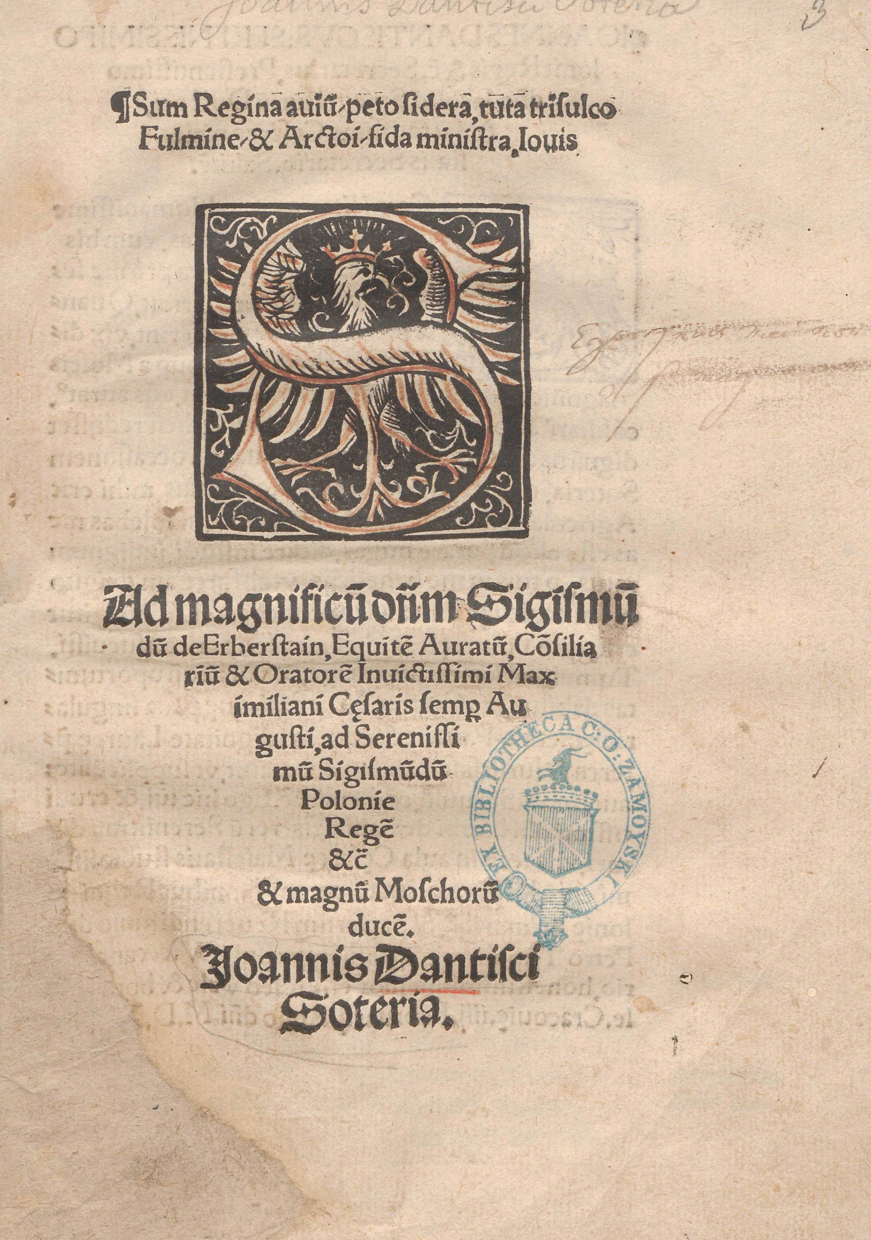
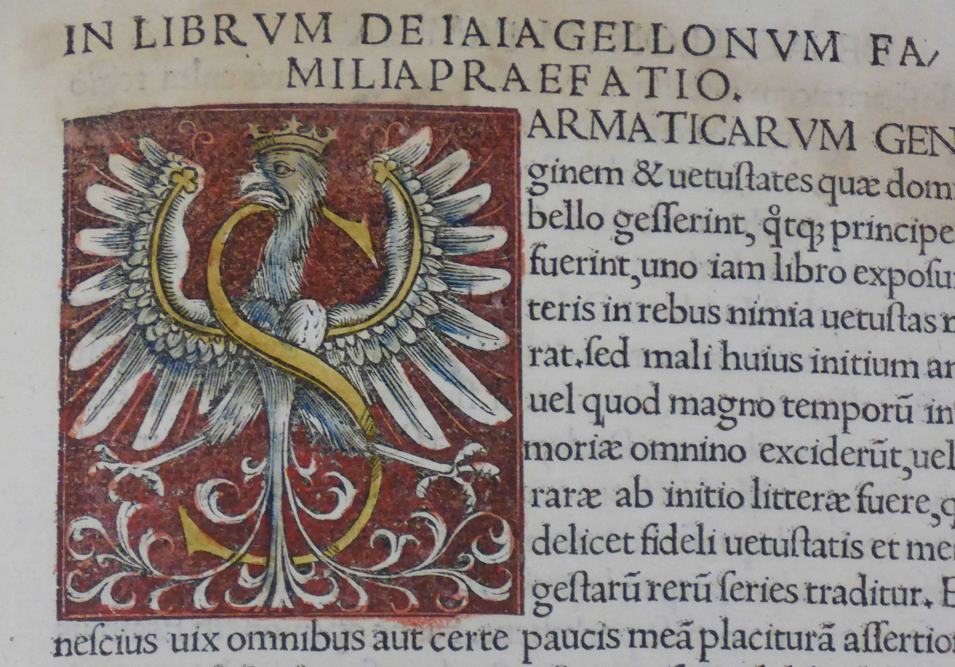
Interestingly, the earliest depictions of the Sigismundian Eagle are preserved in Cracow prints. They were impressed on the title pages (fig.4) or as a figural initial (fig.5) from 1518 onwards (Morka 2006: 323-324). If red colour was applied to these images, in each case it was done manually. Vietor was the first to print the Sigismundian Eagle in colour. By placing it at the beginning of the collection of constitutions of the Polish Kingdom he also introduced this emblem into the system of official state symbols. Yet, as far as we know, nobody after Vietor printed the Sigismundian Eagle in red. The subsequent experiments with impressing the Polish coat of arms in colour were undertaken only by Vietor’s successor, Łazarz Andrysowic, in the 1560s. Łazarz learnt his profession as an apprentice in the printing office, which after Vietor’s death was directed by Barbara Vietor. He married the widow, took possession of Vietor’s office and continued its legacy, also in heraldic colour printing. Nevertheless Łazarz was more successful in introducing printing in register to the production of heraldic woodcuts, as the elaborate coat of arms of the Polish kingdom, impressed on the title page of Statuta Regni Poloniae by Jan Herburt (around 1564) in his printing house, was reprinted several times until 1641.

Fig. 4. The Sigismundian Eagle on the title page of Ad magnificum dominum Sigismundum de Herberstein, ad victoriossisimum Sigismundum Poloniae regem Rudolphi Agricolae iunioris congratulatio (Cracow: Johannes Haller, 1518), hand-coloured woodcut, National Library in Warsaw, shelf-mark SD XVI.Qu.183. Source: POLONA (public domain).
Fig. 5. Initial S in: Jodok Ludwik Decjus, Contenta: De vetustatibus Polonorum Liber I. De Iagellonorum Familia Liber II. De Sigismundi Regis Temporibus Liber III (Cracow: Hieronymus Vietor, 1521), hand-painted woodcut, unnumbered page, National Museum in Kraków (MNK), inv. no. MNK VIII-XVI-264. Photo by Karolina Mroziewicz. I thank the Museum for its kind permission for the publication of the photo.
[expand more_text=”Show more” less_text=”Show less” height=”120″ hide_less=”no” text_color=”#333333″ link_color=”#B26B70″ link_style=”default” link_align=”left”]Quoted literature:

Jaworska, Aleksandra, 2003. Orzeł Biały. Herb państwa polskiego [The White Eagle. The coat of arms of the Polish state]. Warszawa: Wydawnictwo DiG.

Kuczyński, Stefan Krzysztof, 1978. “Barwy biało-czerwone” [White-and-red state colours]. In: Stanisław Russocki, Stefan K. Kuczyński, Juliusz Willaume, Godło, barwy i hymn Rzeczypospolitej. Zarys dziejów [Coat of arms, colours and anthem of the Republic of Poland: Brief history], pp. 83-256. Warszawa: Wiedza Powszechna.

Pastoureau, Michel, 2017. Red: The History of a Color, translated by Jody Gladding. Princeton, New Jersey: Princeton University Press.

Piech, Zenon, 2003. Monety, pieczęcie i herby w systemie symboli władzy Jagiellonów [Coins, seals and coats of arms in the system of Jagiellonian symbols of power]. Warszawa: Wydawnictwo DiG. 

Piekarski, Kazimierz, 1939. „Uwagi o chronologii wydań statutów sejmowych z czasów Zygmunta Starego“ [Notes on the chronology of editions of parliamentary statutes from the times of Sigismund the Old]. Przegląd Biblioteczny 3: pp. 478-495.

Morka, Mieczysław, 2006. Sztuka dworu Zygmunta I Starego. Treści polityczne i propagandowe [The art of the Court of Sigismund I the Old. Political and propagandistic content]. Warszawa: Argraf.

[/expand]

Between Miniature and Print: Colour in Two Editions of Missale Cracoviense

The relationship between miniature and print in the early sixteenth-century liturgical book was very close. During the Middle Ages liturgical books were copied manually. This resulted in changes, errors, omissions, which caused serious differences between them and, therefore, in the rites of the liturgy. Since the half of the fifteenth century the attempts to minimise this incoherence of texts were made by the popes, but the process lasted long and was difficult to control. In 1453 Pope Nicholas V demanded that within a year all parishes should have corrected their missals according to the cathedral missals. Nevertheless, it was still unsuccessful until the printing method enabled such demands to be more realistic.

At that time liturgical books started to be standardised, at least within the dioceses. Bishops ordered the same printed liturgical books and made the parishes buy them. In such a way they tried to unify the liturgy. Catholic Church’s councils and synods demanded to buy and use only confirmed texts. The fact that each diocese was supposed to use only the missals or breviaries prepared especially for them, increased the demand for the printed book and contributed to the development of printing in the Polish lands.

Cracow was one of the first Polish centres where such a reform began. At the turn of the fifteenth and sixteenth centuries the main entrepreneur in Cracow was Johannes Haller. He used his connections with the clergy and secured himself by getting the privilege from Fryderyk Jagiellończyk, the bishop of Cracow and the archbishop of Gniezno for printing the liturgical books. Such privileges were given by the clergy or rulers in order to secure the rights of the publisher and prevent others from printing the same book.

An exclusive right gained by Haller to print the two variants of Missale Cracoviense, was one of the first privileges for printers at all (Juda 1992: 33-34). Before each new edition Haller renewed the privilege and, therefore, he was assured of getting a lot of commissions and a stable income. In order to publish these missals for the Cracovian diocese, Haller started to cooperate with Georg Stuchs, a minor printer from Nuremberg. These two examples were one of the first missals commissioned by Haller (Kawecka-Gryczowa 1983: 45-47). Furthermore, they were printed abroad before he started his own publishing house in Cracow.

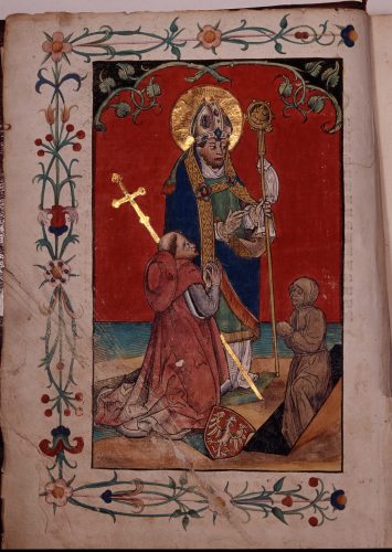
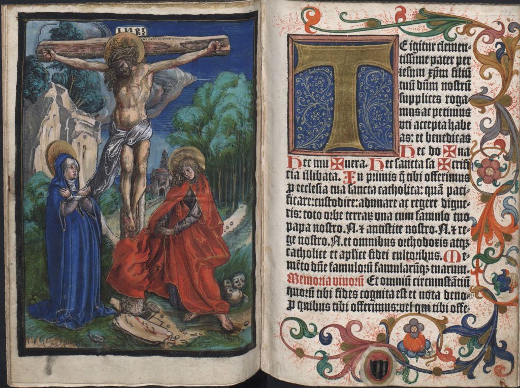
The first one, the copy of which is preserved in the Jagiellonian Library in Cracow (shelf-mark Inc. 2861), was printed probably just after granting the privilege, ca. 1494. Pages of the missal were decorated both with miniatures and hand-coloured woodcuts. These prints were initials and two whole-page figurative scenes: Saint Stanisław Resurrecting Piotrowin accompanied by Fryderyk Jagiellończyk (fig.1) on the title page and Crucifixion (fig.2) on the page preceding the Canon Missae. Canon was the most important part of the book, often printed on parchment whereas the rest was printed on paper. According to tradition, which goes back to the handwritten missals, it started with the representation of the Crucifixion. The woodcut from this copy of Missale Cracoviense was coloured manually with water-based pigments in a typical, limited palette: blue, green, yellow and red (Primeau 2013: 3). The most intensive spots of colour were the Virgin’s and Saint John’s clothes. Also, the angel’s dress and wings were painted with intensive dark green while the parts of the wings of all angels were painted dark blue, green and orange. The colouring is very precise and only very few places are left without any hue, the most visible one being the Apostle’s feet. It seems that even the use of green in the crown of thorns was thought to fit the other elements well.

Fig. 1. Saint Stanisław Resurrecting Piotrowin accompanied by Fryderyk Jagiellończyk in: Missale Cracoviense (Nuremberg: Georg Stuchs, ca. 1494), full-page hand-painted woodcut on parchment, unnumbered title page, Jagiellonian Library, Cracow, shelf-mark Inc. 2861. Source: photo by the Photographic Studio of the National Museum in Cracow.
Fig. 2. Crucifixion in: Missale Cracoviense (Nuremberg: Georg Stuchs, ca. 1494), full-page hand-painted woodcut on parchment (washed in colours, partially painted in gold), unnumbered page, before the Canon of the Mass, Jagiellonian Library, Cracow, shelf-mark Inc. 2861. Source: photo by the Photographic Studio of the National Museum in Cracow.

It is significant that the image of the crucified Christ was very often one of the biggest colourful elements in the whole book. As Primeau suggested “the addition of colour made the images more eye-catching, naturalistic and legible” (Primeau: 2). It seems that the function of colour was to catch the eye of the user and make them stop and contemplate the image of suffering Christ. Such interpretation can be confirmed by the statement that “hues have conveyed meanings that brought the viewer into a closer connection with the divine” (ibid.: 2).

An important and typical feature was the Saviour’s blood which flowed on his head and neck, on arms and hands as well as on the stomach, legs and feet. The presence of blood was an inherent element of coloured scenes of Crucifixion. As the “good” type of red it symbolised the purification and redemption (Adamska 2015: 13; Dackermann 2002: 29-30). The well-considered colouring was emphasised even more by the golden background and halos around the figures’ heads. It is worth noticing that the black frame, typical for the woodcuts, was coloured in an alternate way, in green and red. Again, it seems to be a well-thought idea which fulfils the whole work of art.

The margins of the woodcut were surrounded with an elegant, floral frame composed of flowers. The use of gold and the double frame, the tiny one and a very decorative floral frame on the margins made this composition elegant and precious. One can assume that such form was thought to catch the viewer’s eye and let him admire and contemplate the scene. This elegant way of colouring, distinguished by the golden background, makes the woodcut look more as a miniature than a print. Although the style of the illuminations is already different from earlier ornaments, the way of colouring the woodcuts indicates that it still represented the medieval way of thinking.

Another example of such imitation is the second edition of Missale Cracoviense, which was smaller and destined to be used during travelling. Its copy is also held in the Jagiellonian Library in Cracow (shelf-mark Inc. 2850). This liturgical book was commissioned by Haller and printed by Stuchs in Nuremberg between 1493 and 1500. In this case the scene on the title page (Saint Stanisław Resurrecting Piotrowin accompanied by Fryderyk Jagiellończyk) is uncoloured, only the halo of the saint was painted in gold. Sixteen pages were decorated with hand-coloured woodcut initials and floral illuminations on the margins.

An interesting addition was the woodcut by Lucas Cranach the Elder depicting Crucifixion (fig. 3) which was subsequently pasted on a page before the Canon Missae. It was impressed on parchment and painted very thoroughly with opaque paints (Jurkowlaniec, Herman 2021: 3-4). The scene is much more extended in comparison to the Crucifixion of the ca. 1494 edition of Missale (cf. fig. 2). The figures are not so stiff while the landscape background is full of details. The two prints represent different attitudes of composing space and human figure. Both examples are very precious and elegant, the colour is intensive in each case. However, the shiny golden print stands in contrast with the opaque paints of Cranach’s work. This print is really exceptional because of the subtlety and diversification of colours as well as the lights marked with the white paint. Gold was used here in the halos and as a tiny addition to the saints’ clothes.

Fig. 3. Lucas Cranach, Crucifixion in: Missale Cracoviense (Nuremberg: Georg Stuchs, ca. 1494-1500), full-page hand-painted woodcut on parchment (washed in colours, partially painted in gold), unnumbered page, before the Canon of the Mass, Jagiellonian Library, Cracow, shelf-mark Inc. 2850. Source: photo by the Photographic Studio of the National Museum in Cracow.

All in all, the two editions of Missale Cracoviense are good examples of the infiltration between miniature and print. The manner of painting woodcuts almost thoroughly so that the lines were hardly visible as well as the use of gold and decorative floral motives on margins confirm the thesis that these colourful elements imitated the decoration of illuminated manuscripts. Moreover, it proves a high demand that the liturgical books should still resemble the well-known medieval form.

Quoted literature:

Adamska, Anna, 2015. “Gra w kolory. Rola barw w średniowiecznym systemie komunikacji społecznej” [Playing with colours: the role of colours in the medieval system of social communication]. Roczniki Historyczne 81: pp. 7-34.

Dackermann, Susan, 2002. Painted Prints: The Revelation of Color in Northern Renaissance & Baroque Engravings, Etchings & Woodcuts. Baltimore: Baltimore Museum of Art; University Park: Pennsylvania University Press.

Juda, Maria, 1992. Przywileje drukarskie w Polsce [The privileges of printers in Poland], Lublin: Agencja Wydawniczo-Handlowa AD.

Jurkowlaniec, Grażyna, Herman, Magdalena, 2021. “Introduction”. In The Reception of the Printed Image in the Fifteenth and Sixteenth Centuries: Multiplied and Modified, edited by Grażyna Jurkowlaniec and Magdalena Herman, pp. 1-23. New York: Routledge.

Kawecka-Gryczowa, Alodia, 1983. “Haller Jan.” In: Drukarze dawnej Polski, pp. 44-62.

Primeau, Thomas, 2013. “Coloring Within the Lines: The Use of Stencil in Early Woodcuts,” Art in Print”, 3/ 3. Available online: https://artinprint.org/article/coloring-within-the-lines-the-use-of-stencil-in-early-woodcuts/ (accessed: 20.11.2020)

Johannes Haller’s Printer-Publisher’s Marks: Red for Recognition

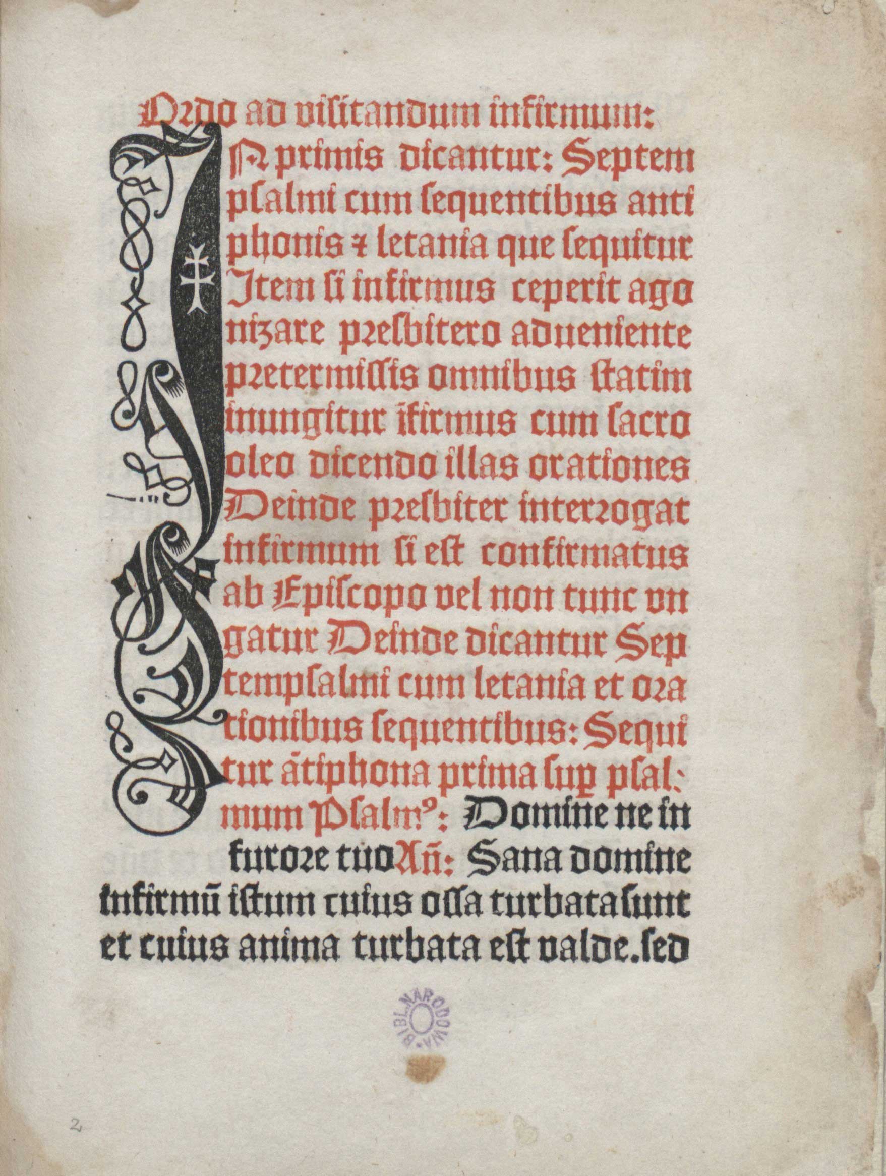
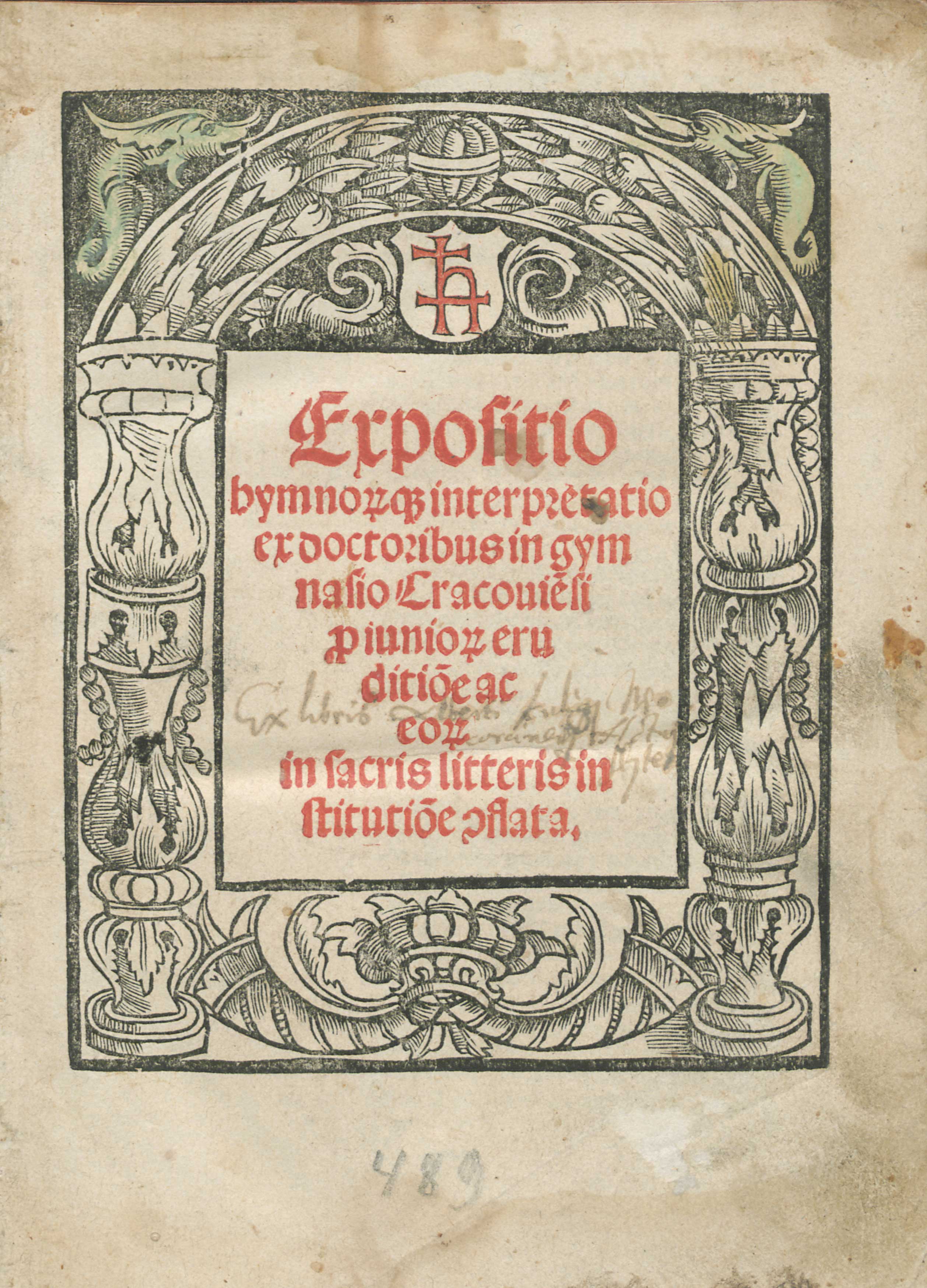
The first examples of the use of the technique of colour printing in the Polish Kingdom were rather modest and linked with typeface and page layout. The earliest printed Cyrillic books, released by Sveboldus Fiol around 1491 in Cracow, had parts of texts printed in red and some of them also had red initials and ornamental vignettes. Red initials and parts of texts were also important components of Konrad Baumgarten’s Agenda (Gdańsk, 1499, fig.1), which opens with an elegant, vertical black initial into which a white double cross was cut. Johannes Haller went one step further, and had his mark, a characteristic minuscule h combined with a double cross, cut into initials impressed in red. These monochromatic red-and-white signs were printed in 1505 in the pages with musical notes in a missal which Haller financed and, ten years later, in another missal printed in his office. The mark of Johannes Haller appeared in colour once more in 1516 in a prominent place of the title page of his Expositio hymnorumque interpretatio pro iuniorum eruditione by Michael Falkener.

Fig. 1. First page of Agenda sive Exsequiale sacramentorum (Gdańsk: Konrad Baumgarten, 1499), decorative initial, text printed in red and black, National Library, Warsaw, shelf-mark Inc.Qu.141, fol. A2r. Source: POLONA (public domain).

Johannes Haller was a German-born, wealthy merchant successfully operating his numerous businesses in Cracow. Apart from selling wine and Hungarian copper, he owned a bookshop (from 1494), papermill (from 1510) as well as a tannery and he virtually monopolized the Cracow print market until 1517. Around 1502/1503 Haller brought to Cracow and financially supported Kasper Hochfeder, a printer with whom he collaborated earlier on the publication of liturgical and academic books for the Polish market in Nuremberg and Metz. In Cracow Hochfeder operated a printing press installed in Haller’s own house. The most important achievement of Haller’s and Hochfeder’s collaboration was the first missal printed in Poland, Missale Vratislaviense, published in 1505 (Kawecka-Gryczowa 1983: 45; Bacewiczowa 1983: 64). Whereas the name of the printer was mentioned nowhere in this book, the role of Haller, who along with Sebastian Hyber financed the publication, was given in the colophon and additionally signified by Haller’s mark in the initial impressed in the quire with the musical notes.

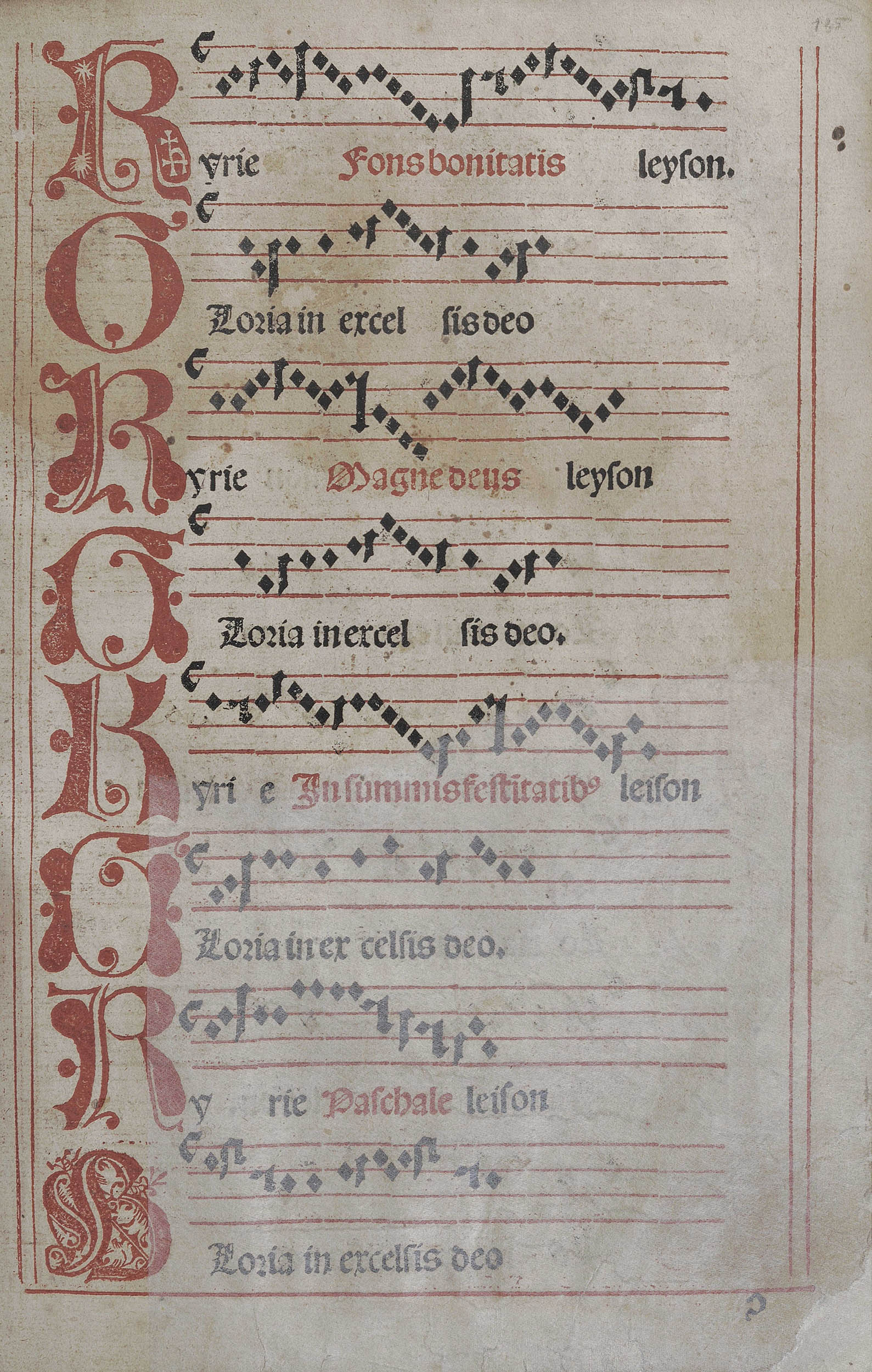
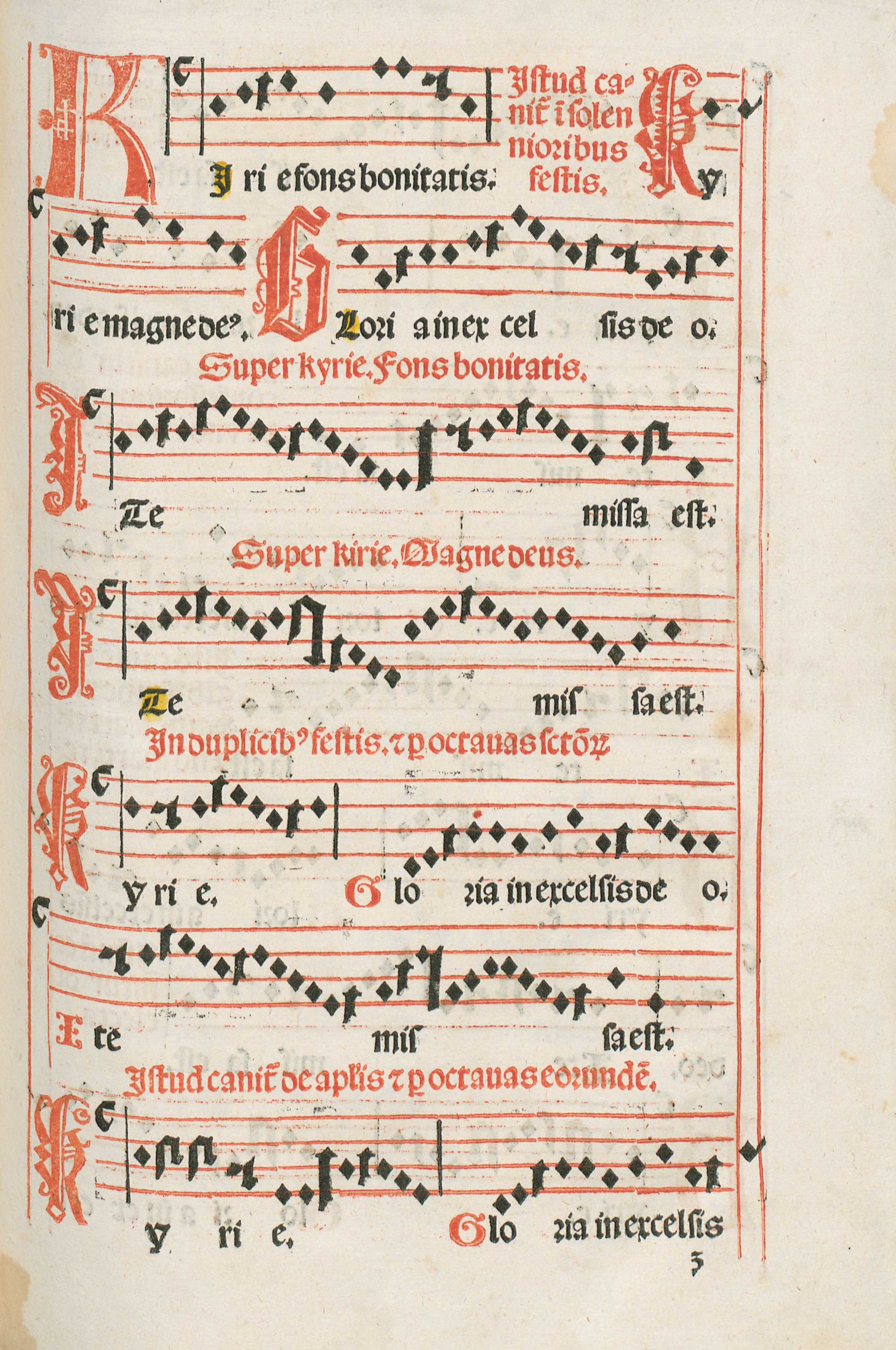
Johannes Haller’s marks appeared four times in Missale Vratislaviense on the top of the page inscribed into an initial K that indicated the beginning of the vocal part of Kyrie. The shape of the red initial with Haller’s mark corresponds with the four-line stave , also printed in red (fig.2). The upper serif of the letter finds its continuation in the first line of the stave and the lower serif continues as the first line of the next stave. Haller’s mark is at the same register as the text of the Kyrie chant, thus its placement was of high compositional and semantic importance.

Fig. 2. Page with musical notation and Johannes Haller’s mark inscribed into red initial in Missale Vratislaviense (Cracow: Kaspar Hochfeder, 1505), two superimposed impressions in register, Jagiellonian Library, Cracow, shelf-mark Cim. 8737, fol. ɔ1r, Source: POLONA (public domain).

The musical notes in Missale Vratislaviense are considered to be the first printed ones in the Polish Kingdom (Przywecka-Samecka 1987: 21). They were impressed in the technique of two superimposed impressions in register, analogical to the colour printing from multiple blocks. Firstly, the form with vertical lines, the initial with Haller’s mark cut into it and the remaining initials along with the staves were impressed in red ink. The form with notes and text was printed in black in the second run through the press. This was a challenging method that required precision and high technical skills from the printer. For the publisher it meant a large financial commitment.

The use of illustrations also made Haller’s enterprise more expensive. Missale Vratislaviense contain three high quality full-page woodcuts: an anonymous scene from the life of the patron saint of the Polish Kingdom St. Stanislas, the elaborate heraldic title page with the depiction of St. John the Baptist and St. Hedwig of Silesia, executed by Konrad Baumgarten (the same who printed the decorative black-and-white initial in his Agenda) and a Crucifixion scene: a woodcut executed by Lucas Cranach the elder (in the so-called variant C of the Missal) or the one attributed to Baumgarten (in variant identified as A and B). Hence Haller had many reasons for his pride as a publisher of the Missal and all rights to mark his role within the book.

Haller, who took over the Hochfeder printing shop in 1505, soon specialized in printing musical notations in the liturgical books, which he included in several missals, agendas and breviaries. In Missale Cracoviense of 1515/1516, an ambitious enterprise undertaken after a two-year crisis of Haller’s printing office (Kapełuś 1962: 9), he had his mark impressed again as a part of the initial K (in Kyrie, fig.3) and also in the initial P (in Per). Once more K with Haller’s mark appears at the beginning of the vocal parts and opens the Kyrie fons bonitatis, referring to Lord as the source of good. P starts the phrase Per omnia secula seculorum indicating the eternal glory of God. These two red initials introduce important texts of the Roman Mass and along with regular red initials, red stave and vertical lines as well as the black text and notes, they build up an intricate and coherent layout of the printed page.

Fig. 3. Page with musical notation and Johannes Haller’s mark inscribed into red initial in Missale Cracoviense (Cracow: Johannes Haller: 1515/1516), two superimposed impressions in register, Ossoliński National Institute, Wrocław, shelf-mark XVI.F.4053, fol. ɜ1r. Source: Ossoliński National Institute, Wrocław.

Haller’s signum is even more emphasized on the title page of Expositio hymnorumque interpretatio pro iuniorum eruditione (fig.4), a textbook on the theory and practice of religious poetry, church hymns and canticles. Here the first letter of the printer’s surname along with the double cross are printed in red in the middle of the white shield placed above the field with the title of the book, which was also printed in red. Whereas on the regular page colour was generally used to highlight and prioritize particular parts of visual-cum-literary content, on the title page it functioned as an eye-catcher for the potential buyer and reader. In the title page of Expositio the use of red colour was also referential. Apart from decorating the title page, it advertised the skills and financial assets of the printer, well known from his earlier products, and announced the musical content of the book, in which Haller occupied a dominant place at the Polish market.

Fig. 4. Title page of Michael Falkener’s Expositio hymnorumque interpretatio ex doctoribus in gymnasio Cracouiensi pro iuniorum eruditione ac eorum in sacris litteris institutione conflata (Cracow: Johannes Haller: 1516), title of the treatise and Haller’s mark printed in red, Ossoliński National Institute, Wrocław, shelf-mark XVI.Qu.2068. Source: Ossoliński National Institute, Wrocław.

Between 1505 and 1525, as Justyna Kiliańczyk-Zięba shows, Haller often used his mark as a merchant signum on the paper produced in his paper mill and in the books he published or printed (Kiliańczyk-Zięba 2018: 316-317). It served the purpose of authentication of his products and ensured the visibility of their publisher or printer. Yet only rarely did Haller utilize red ink for the impressions of his signum. In all cases, it appeared either on the pages with musical notations or on the title page of the book on musical theory and practice. The reason for such placement of the marks might have been Haller’s awareness of the innovative and prestigious character of the musical prints and quest for the recognition of his merits. The addition of red colour, customarily utilized in books to draw the attention of the reader-viewer and associated among others with courage and sacrifice, was a perfect means of demonstrating Haller’s leading role on the print market and reinforcing it at the same time.


[expand more_text=”Show more” less_text=”Show less” height=”120″ hide_less=”no” text_color=”#333333″ link_color=”#B26B70″ link_style=”default” link_align=”left”]Quoted literature:

Bacewiczowa, Danuta, 1983. “Hochfeder Kasper.” In: Drukarze dawnej Polski od XV do XVIII wieku. Tom 1: Małopolska. Część 1: Wiek XV-XVI [Printers in old Poland from the 15th– to the 18th-century. Vol. 1: Lesser Poland. Part 1: 15th-16th century], edited by Alodia Kawecka-Gryczowa, pp. 62-68. Wrocław et al.: Zakład Narodowy im. Ossolińskich; Wydawnictwo Polskiej Akademii Nauk. 

Kapełuś, Helena, 1962. “Jan Haller.” In: Polonia Typographica Saeculi Sedecimi, no. 4: Jan Haller. Kraków 1505–1525, edited by Alodia Kawecka-Gryczowa, part 1: Wstęp, wykaz druków [Introduction and the list of prints]. Wrocław: Zakład Narodowy im. Ossolińskich.

Kawecka-Gryczowa, Alodia, 1983. “Haller Jan.” In: Drukarze dawnej Polski, pp. 44-62.

Kiliańczyk-Zięba, Justyna, 2018. “Transition of the Printer’s Device from a Sign of Identification to a Symbol of Aspirations and Beliefs.” In: Typographorum Emblemata: The Printer’s Mark in the Context of Early Modern Culture, edited by Anja Wolkenhauer and Bernhard F. Scholz, pp. 315–332. Berlin; Boston, Mass.: De Gruyter Saur.

Przywecka-Samecka, Maria, 1987. Drukarstwo muzyczne w Europie do końca XVIII wieku [Musical printing in Europe until the end of the 18th century]. Wrocław: Zakład Narodowy im. Ossolińskich.

[/expand]