The early printed missals were dominated by two colours: black and red. This diversification of type colour played a practical role and was used already in the manuscripts. At the beginning the printing of both colours simultaneously was more expensive and complicated technically because it demanded the separate printing of each colour. Therefore, sometimes in the early incunabula the blank spaces were left and filled in with red text manually (Ikeda 2015: 65; König 2018: 267). These red fragments, called rubrics from the Latin ruber (red), described the commentaries and remarks for priests which were not supposed to be read to the faithful. Nigrics, from the Latin niger (black) were the prayers in black which should be read during the service (King 1957: 181-182). It is interesting that it was red, the more visible colour, which signalled the silent parts.
However, the use of colour was not only limited to the printed text. Hand-colouring was the main method of decorating woodcuts such as whole-page images and initials. Sometimes, colour was used to emphasise the most important parts of the liturgy or prayers. The variety of initials as well as their modifications can be discussed on the example of two copies of Missale Cracoviense printed c. 1515/1516 by Johannes Haller in Cracow. The copy with no manual colouring is preserved in the Kórnik Library of the Polish Academy of Sciences (shelf-mark Cim.F.4107) while the illuminated copy is held in the Ossoliński National Institute in Wrocław (shelf-mark XVI.F.4053).
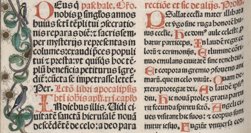
These two liturgical books included few kinds of initials, differentiated by size and ornamentation. The first group was the same in both copies. It consisted of very simple, slightly bigger, two-line letters, printed in red (fig. 1, fig. 2). In most cases they marked the beginning of the paragraphs.
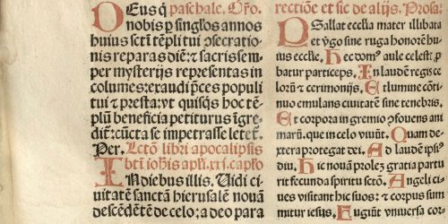
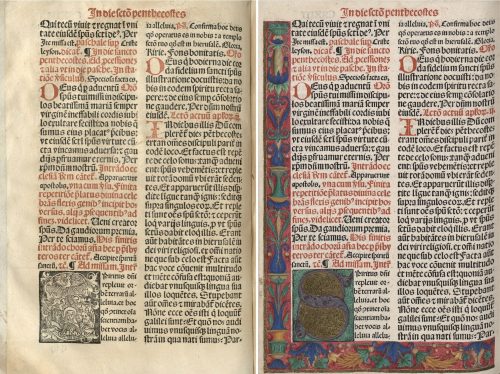
The rest of the initials were black and white woodcuts, coloured manually in the case of the copy held in Ossolineum. Three-line initials were the second and the most considerable group (fig. 3). The letters were inscribed in a square while the background was filled with various floral motives. In the illuminated copy the majority of initials was painted by hand according to the scheme: a monochromatic letter and another or few other hues for the ornament.

Similar in form, but much bigger, were six- and eight-line initials, consisted of letters entangled in flowers, tendrils or geometrical shapes (fig. 4). In the illuminated copy one or two colours were used to decorate the letter and few others to paint the rest of the motives.
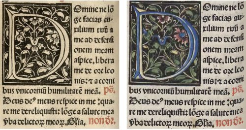
In each of these cases the letters and other elements remained visible, the only change was the addition of colours. Nevertheless, significant changes appeared in the group of the biggest and the most elegant initials. In the uncoloured copy of the missal one can see figural initials, scenes which were connected directly to the proper part of liturgy, for example: the Nativity, the Magi, the Resurrection, the Assumption of Mary or the Trinity. In the colourful copy these scenes were painted so thoroughly that they were not visible (fig. 5). Woodcuts disappeared under a thick layer of paint. It covered the fleshy floral contours of the letters completely, while the spaces inside the letters were filled with gold. Maroon, red, blue, green and violet dominated this decoration. Presumably, such dark hues were used in order to cover the lines of the composition better.

These carefully designed hand-painted decorative elements were complemented with an exquisitely illuminated bordure made of floral and architectural ornaments. Such decorations on margins appeared only in combination with the most elegant initials, so they were meant to emphasise the indicated part of the text. The first page following the calendar part was decorated with an initial A and a bordure with vases and floral motives such as flowers, tendrils and leaves (fig. 6).
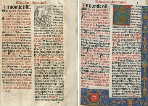
A distinctive element in the bottom left corner of the page was the Prus coats of arms in a wreath. The name written on the shield (Joannes Schikowsky) referred directly to the alleged owner of this exemplar, Johannes Szykowski (d. 1535), a clergyman, related to the cathedral in Cracow and the parish priest of Gnojno. A specific and local floral motif, which appeared on another page, twigs, leaves and flowers of carnation, was recognized as another feature which led to the same person. This characteristic element was connected with the ex-libris of Johannes Szykowski with four carnations flanking the composition (Gruczyński 1967: 57). Unfortunately, the original location of the bookplate is unknown. Zofia Ameisenowa made an assumption that it was made in the woodcut workshop working for the Cracow printer Florian Ungler c. 1530 (Ameisenowa 1947: 14-15; the connection between the two bookplates, the woodcut and the painted one, was, however, partially undermined by Anna Lewicka-Kamińska (1970: 143-146)).
The floral bordure, which surrounded the text from three sides, occurred also on the first page of the Canon in the illuminated copy of the book. This special part of the missal, printed on the parchment and containing the most important liturgical prayer, begins with the words “Te igitur”, starting with the letter T. Its shape was associated with the cross and, therefore, in many cases it was decorated in an exceptional way. In this copy of Missale Cracoviense it was the five-line initial with a figurative scene, the only one in the whole book which had not been painted over. It represented the sacrifice of Isaac, which, within this context, referred directly to the sacrifice of Christ as God’s only Son (fig. 7).
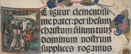
The Canon part was preceded by the whole-page woodcut depicting Crucifixion. It is worth noticing that its colours referred to other elements of decoration. First of all, the hues resembled the ones used in the biggest initials with gold. Second of all, the double frame of the woodcut corresponded to the figural initial on the adjacent page. Red used in the inner frame and grey used in the outer frame were repeated in the initial. This colour scheme brings the two images even closer to each other and suggests a direct connection between the meaning of these two scenes. Unfortunately, the copy held in Kórnik lacks the Canon part, which prevents further comparisons and conclusions.
An elegant and refined decoration of illuminated copy of the Missale Cracoviense consisted of five kinds of colourful initials, coloured Crucifixion and a subtle ornamental bordure. Covering the figural initials with paint so thoroughly that they were invisible can be an evidence of a strong attachment to the medieval way of perceiving a book. The owner of the illuminated copy must have been a bibliophile, for whom the colour added manually to the printed book had a special artistic and aesthetic value. Yet, the illuminations which he had commissioned did not respect the original iconographic programme of the book. The original meaning and function of the most significant initials have been lost in the illuminated copy of the Missale (fig. 8). By means of colour the illuminator has interpreted the iconography of the missal and, at the same time, created, in fact, a new work of art.
Quoted literature:
Ameisenowa, Zofia 1947. Dwa nieznane polskie znaki książkowe z XVI wieku [Two unknown Polish sixteenth-century bookplates]. Kraków: Towarzystwo Miłośników Książki.
Gruczyński, Stanisław, 1967. “Ekslibris Jana Szykowskiego” [Jan Szykowski’s bookplate]. Roczniki Biblioteczne, vol. 11, no. 1/2: pp. 55-61.
Ikeda, Mayumi, 2015. “The Fust and Schöffer Office and the Printing of the Two-Colour Initials in the 1457 Mainz Psalter”. In Printing Colour 1400-1700, edited by Ad Stijnman and Elizabeth Savage, pp. 65-75. Leiden, Boston: Brill.
Kawecka-Gryczowa, Alodia, 1983. “Haller Jan.” In Drukarze dawnej Polski, pp. 44-62.
King, Archdale A., 1957. “Rubrics”. In: Liturgy of the Roman Church, pp. 181-183. London: Longmans.
König, Eberhard 2018. “Colour for the Black Art”. In Painting the Page in the Age of Print: Central European Manuscript Illumination of the Fifteenth Century, edited by Jeffrey F. Hamburger, Robert Suckale, Gude Suckale-Redlefsen, translated by David Sánchez, pp. 265-290. Toronto: Pontifical Institute of Mediaeval Studies.
Lewicka-Kamińska, Anna 1970. “Ekslibris Anonima herbu Prus I” [The bookplate of the Anonim of the Prus coat of arms I]. Biuletyn Biblioteki Jagiellońskiej, vol. 20, no. 1/2: pp. 141–146, il. 12.