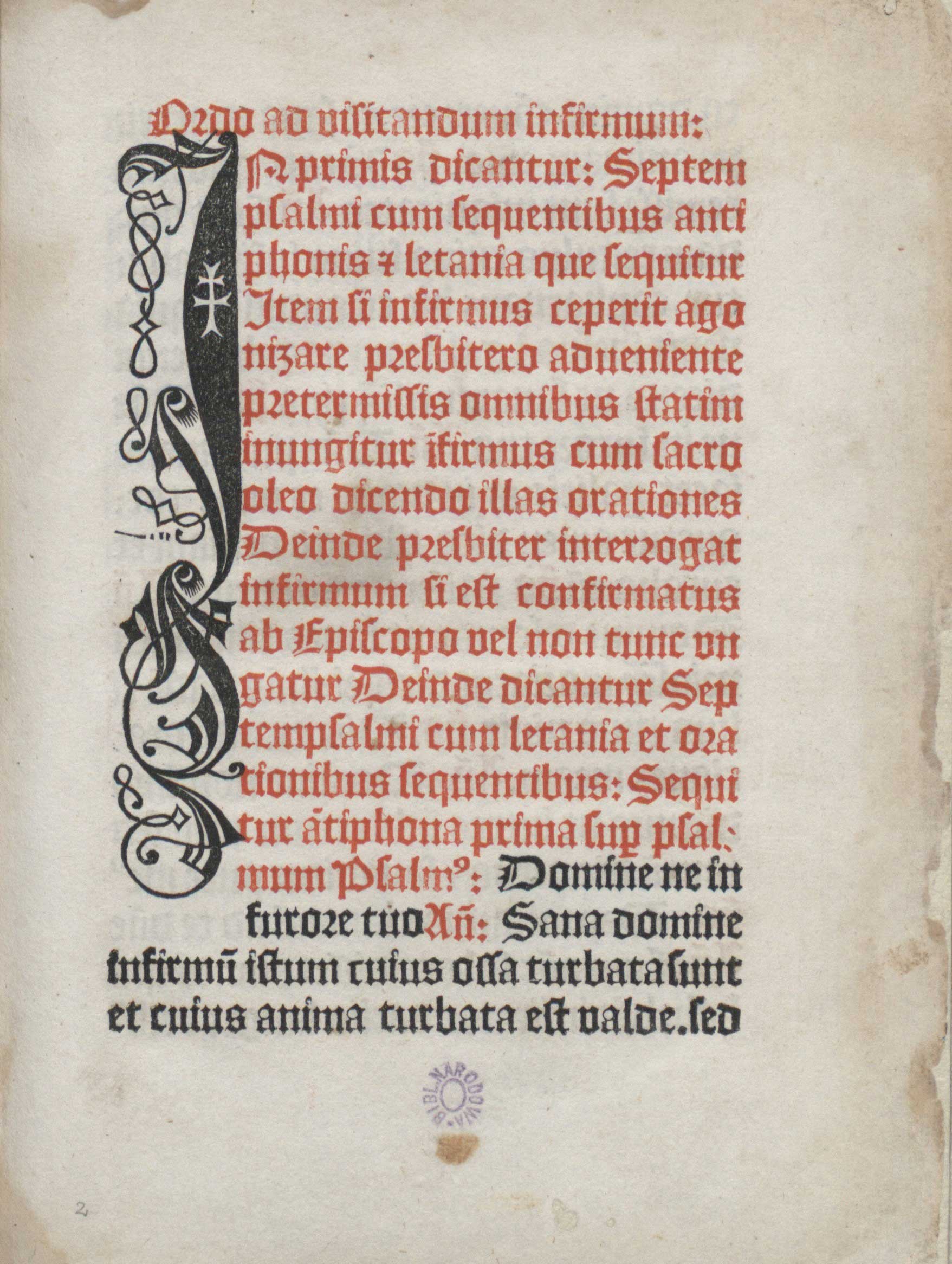
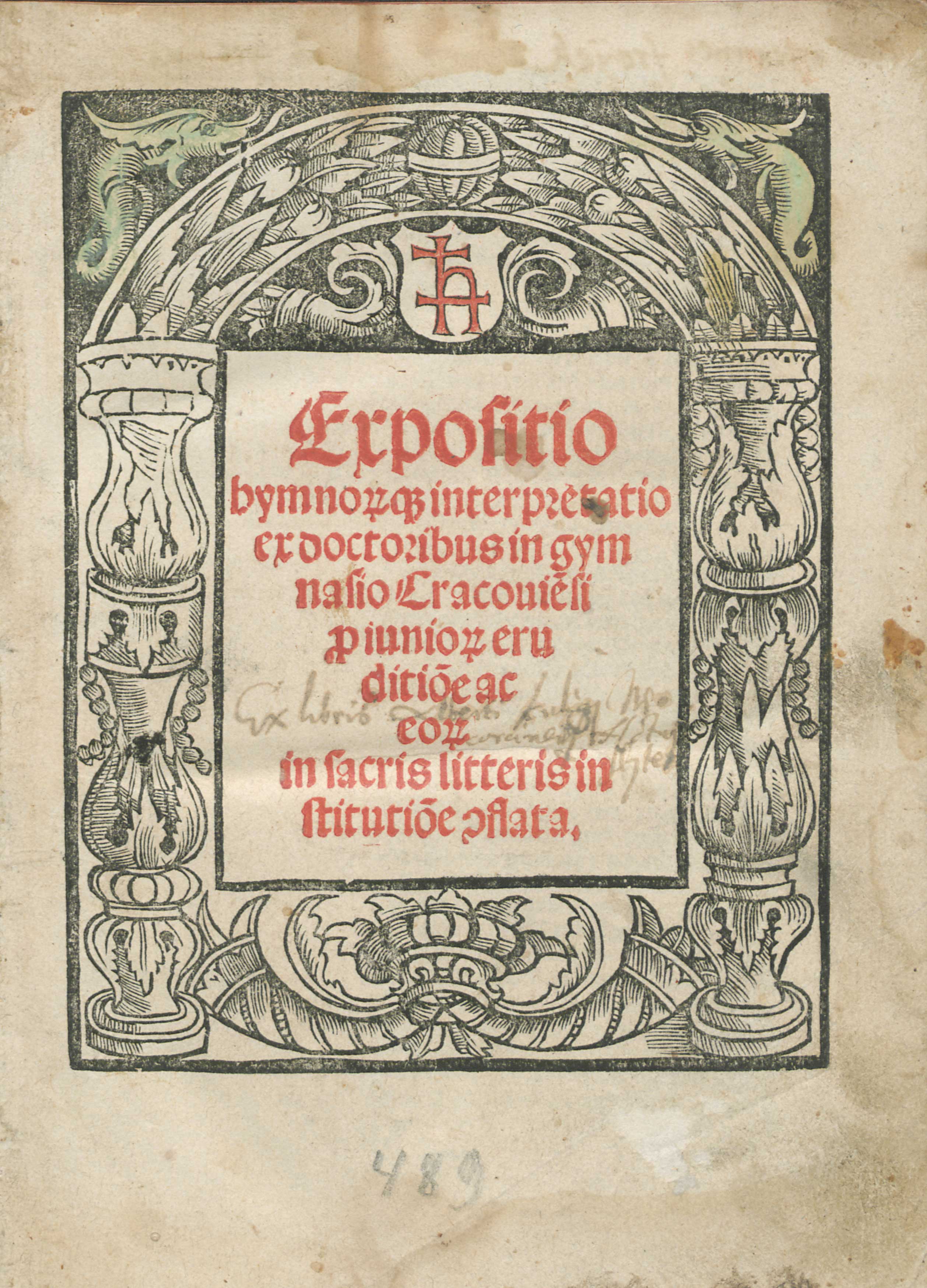
The first examples of the use of the technique of colour printing in the Polish Kingdom were rather modest and linked with typeface and page layout. The earliest printed Cyrillic books, released by Sveboldus Fiol around 1491 in Cracow, had parts of texts printed in red and some of them also had red initials and ornamental vignettes. Red initials and parts of texts were also important components of Konrad Baumgarten’s Agenda (Gdańsk, 1499, fig.1), which opens with an elegant, vertical black initial into which a white double cross was cut. Johannes Haller went one step further, and had his mark, a characteristic minuscule h combined with a double cross, cut into initials impressed in red. These monochromatic red-and-white signs were printed in 1505 in the pages with musical notes in a missal which Haller financed and, ten years later, in another missal printed in his office. The mark of Johannes Haller appeared in colour once more in 1516 in a prominent place of the title page of his Expositio hymnorumque interpretatio pro iuniorum eruditione by Michael Falkener.
Johannes Haller was a German-born, wealthy merchant successfully operating his numerous businesses in Cracow. Apart from selling wine and Hungarian copper, he owned a bookshop (from 1494), papermill (from 1510) as well as a tannery and he virtually monopolized the Cracow print market until 1517. Around 1502/1503 Haller brought to Cracow and financially supported Kasper Hochfeder, a printer with whom he collaborated earlier on the publication of liturgical and academic books for the Polish market in Nuremberg and Metz. In Cracow Hochfeder operated a printing press installed in Haller’s own house. The most important achievement of Haller’s and Hochfeder’s collaboration was the first missal printed in Poland, Missale Vratislaviense, published in 1505 (Kawecka-Gryczowa 1983: 45; Bacewiczowa 1983: 64). Whereas the name of the printer was mentioned nowhere in this book, the role of Haller, who along with Sebastian Hyber financed the publication, was given in the colophon and additionally signified by Haller’s mark in the initial impressed in the quire with the musical notes.
Johannes Haller’s marks appeared four times in Missale Vratislaviense on the top of the page inscribed into an initial K that indicated the beginning of the vocal part of Kyrie. The shape of the red initial with Haller’s mark corresponds with the four-line stave , also printed in red (fig.2). The upper serif of the letter finds its continuation in the first line of the stave and the lower serif continues as the first line of the next stave. Haller’s mark is at the same register as the text of the Kyrie chant, thus its placement was of high compositional and semantic importance.
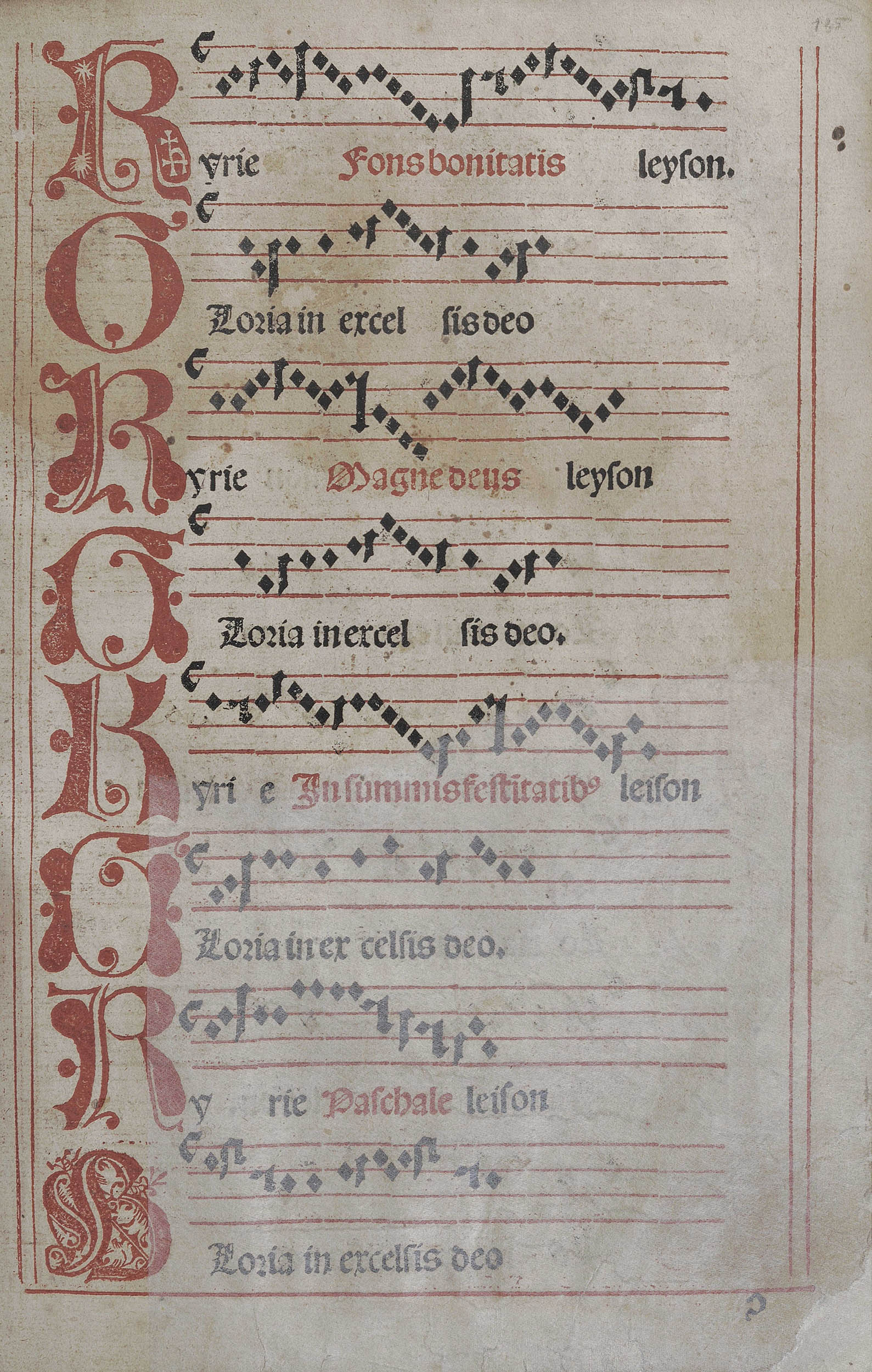
The musical notes in Missale Vratislaviense are considered to be the first printed ones in the Polish Kingdom (Przywecka-Samecka 1987: 21). They were impressed in the technique of two superimposed impressions in register, analogical to the colour printing from multiple blocks. Firstly, the form with vertical lines, the initial with Haller’s mark cut into it and the remaining initials along with the staves were impressed in red ink. The form with notes and text was printed in black in the second run through the press. This was a challenging method that required precision and high technical skills from the printer. For the publisher it meant a large financial commitment.
The use of illustrations also made Haller’s enterprise more expensive. Missale Vratislaviense contain three high quality full-page woodcuts: an anonymous scene from the life of the patron saint of the Polish Kingdom St. Stanislas, the elaborate heraldic title page with the depiction of St. John the Baptist and St. Hedwig of Silesia, executed by Konrad Baumgarten (the same who printed the decorative black-and-white initial in his Agenda) and a Crucifixion scene: a woodcut executed by Lucas Cranach the elder (in the so-called variant C of the Missal) or the one attributed to Baumgarten (in variant identified as A and B). Hence Haller had many reasons for his pride as a publisher of the Missal and all rights to mark his role within the book.
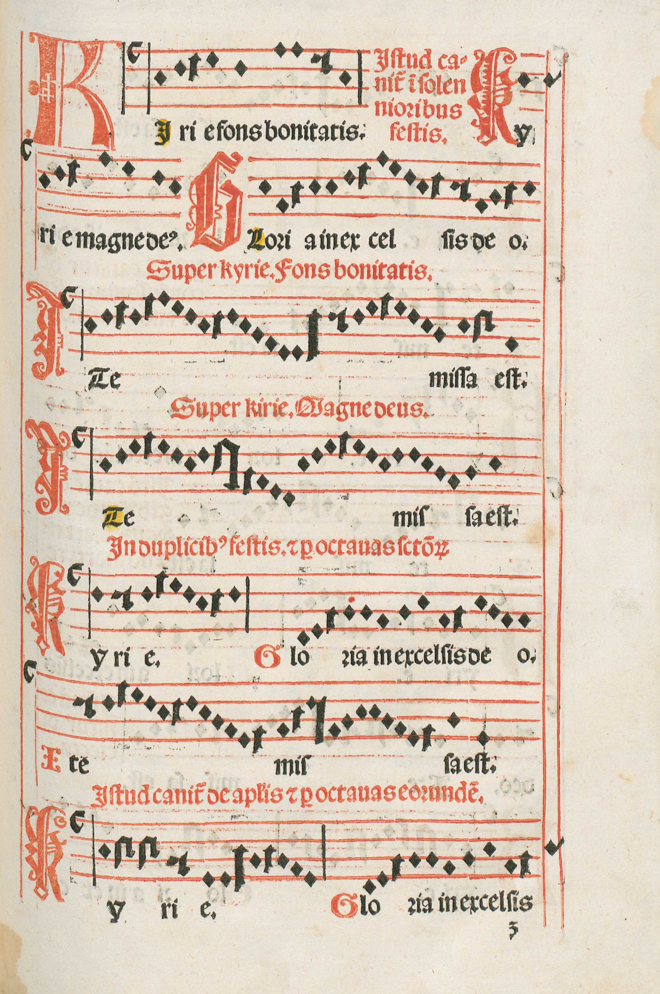
Haller, who took over the Hochfeder printing shop in 1505, soon specialized in printing musical notations in the liturgical books, which he included in several missals, agendas and breviaries. In Missale Cracoviense of 1515/1516, an ambitious enterprise undertaken after a two-year crisis of Haller’s printing office (Kapełuś 1962: 9), he had his mark impressed again as a part of the initial K (in Kyrie, fig.3) and also in the initial P (in Per). Once more K with Haller’s mark appears at the beginning of the vocal parts and opens the Kyrie fons bonitatis, referring to Lord as the source of good. P starts the phrase Per omnia secula seculorum indicating the eternal glory of God. These two red initials introduce important texts of the Roman Mass and along with regular red initials, red stave and vertical lines as well as the black text and notes, they build up an intricate and coherent layout of the printed page.
Haller’s signum is even more emphasized on the title page of Expositio hymnorumque interpretatio pro iuniorum eruditione (fig.4), a textbook on the theory and practice of religious poetry, church hymns and canticles. Here the first letter of the printer’s surname along with the double cross are printed in red in the middle of the white shield placed above the field with the title of the book, which was also printed in red. Whereas on the regular page colour was generally used to highlight and prioritize particular parts of visual-cum-literary content, on the title page it functioned as an eye-catcher for the potential buyer and reader. In the title page of Expositio the use of red colour was also referential. Apart from decorating the title page, it advertised the skills and financial assets of the printer, well known from his earlier products, and announced the musical content of the book, in which Haller occupied a dominant place at the Polish market.
Between 1505 and 1525, as Justyna Kiliańczyk-Zięba shows, Haller often used his mark as a merchant signum on the paper produced in his paper mill and in the books he published or printed (Kiliańczyk-Zięba 2018: 316-317). It served the purpose of authentication of his products and ensured the visibility of their publisher or printer. Yet only rarely did Haller utilize red ink for the impressions of his signum. In all cases, it appeared either on the pages with musical notations or on the title page of the book on musical theory and practice. The reason for such placement of the marks might have been Haller’s awareness of the innovative and prestigious character of the musical prints and quest for the recognition of his merits. The addition of red colour, customarily utilized in books to draw the attention of the reader-viewer and associated among others with courage and sacrifice, was a perfect means of demonstrating Haller’s leading role on the print market and reinforcing it at the same time.
[expand more_text=”Show more” less_text=”Show less” height=”120″ hide_less=”no” text_color=”#333333″ link_color=”#B26B70″ link_style=”default” link_align=”left”]Quoted literature:
Bacewiczowa, Danuta, 1983. “Hochfeder Kasper.” In: Drukarze dawnej Polski od XV do XVIII wieku. Tom 1: Małopolska. Część 1: Wiek XV-XVI [Printers in old Poland from the 15th– to the 18th-century. Vol. 1: Lesser Poland. Part 1: 15th-16th century], edited by Alodia Kawecka-Gryczowa, pp. 62-68. Wrocław et al.: Zakład Narodowy im. Ossolińskich; Wydawnictwo Polskiej Akademii Nauk.
Kapełuś, Helena, 1962. “Jan Haller.” In: Polonia Typographica Saeculi Sedecimi, no. 4: Jan Haller. Kraków 1505–1525, edited by Alodia Kawecka-Gryczowa, part 1: Wstęp, wykaz druków [Introduction and the list of prints]. Wrocław: Zakład Narodowy im. Ossolińskich.
Kawecka-Gryczowa, Alodia, 1983. “Haller Jan.” In: Drukarze dawnej Polski, pp. 44-62.
Kiliańczyk-Zięba, Justyna, 2018. “Transition of the Printer’s Device from a Sign of Identification to a Symbol of Aspirations and Beliefs.” In: Typographorum Emblemata: The Printer’s Mark in the Context of Early Modern Culture, edited by Anja Wolkenhauer and Bernhard F. Scholz, pp. 315–332. Berlin; Boston, Mass.: De Gruyter Saur.
Przywecka-Samecka, Maria, 1987. Drukarstwo muzyczne w Europie do końca XVIII wieku [Musical printing in Europe until the end of the 18th century]. Wrocław: Zakład Narodowy im. Ossolińskich.
[/expand]