The Latin words ruber and rubrica refer to red ink and a title, chapter or paragraph which was marked with red ink in handwritten books. The term for the liturgical calendar, rubricella, clearly signalized the importance of red colour for this type of calendar. In medieval Latin rubricella meant simply a small rubrica. Red marked Sundays and all important festive days firstly in the handwritten calendars and afterwards also in the printed ones. Apart from highlighting holidays, red ink was also used to print the title of the calendar and, in the case of Łazarz Andrysowic’s prints of 1549–1570, also the bishop’s coat of arms on the rubricella’s title page.
Polish handwritten rubricellae are known only from historical records. The earliest preserved liturgical calendar is Rubricella Cracoviensis ad annum 1507 printed in Cracow by Johannes Haller. Because of their intensive use within a limited time only a small percentage of the calendars’ copies survived to the present day. Yet, the demand for rubricellae was very high. Every parish needed a list of liturgies, fasts and festive days to guide clergymen through the forms of Divine Office, Holy Mass and other liturgies to be said each day from the 1st January to the 31st December. As each diocese had its own set of festive days as well as celebrating universal ones, such as for instance Easter, which was a moveable feast, dioceses needed a new liturgical calendar each year. Moreover, most of the sixteenth-century rubricellae consists of only 2 up to 16 pages, which made them quick and cheap to print. Because the production of the liturgical calendars was a lucrative and relatively low-cost business, the Cracow printers endeavoured to get such commissions and special printing privileges from the local bishops (Juda 1992: 56).
After the Rubricella for 1507,several subsequent liturgical calendars printed by Johannes Haller, Florian Ungler and Hieronimus Vietor are known. After Vietor’s death, the profitable business of printing rubricellae was continued by his widow and then by her new husband Łazarz Andrysowic. By this time liturgical calendars already had their fixed visual form. The title of the calendar was generally printed partly or entirely in red. The coat of arms of the bishop, or in the rare cases that of the diocese, was printed below the title. Most commonly it was placed in a wreath and often followed by stemma, a short heraldic poem. Andrysowic’s contribution was the introduction of printed colour to the bishops’ coats of arms.
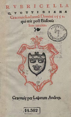
The earliest of Łazarz Andrysowic’s red-and-black woodcuts was rather basic. It was a heraldic composition on the title page of his Rubricella quottidiana Cracovien[sis] ad annu[m] Domini 1551…. (fig. 1), printed just two years after Andrysowic as an apprentice entered the printing shop of Barbara Vietor.
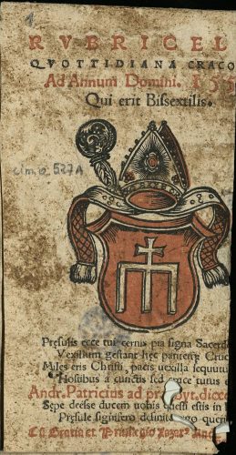
Fig. 1. Title page of Rubricella quottidiana Cracovien[sis] ad annu[m] Domini 1551 qui erit post Bissextilem tertius (Cracow: Łazarz Andrysowic, 1550), Ossoliński National Institute, shelfmark XVI.O.1063. Source: Lower Silesian Digital Library (public domain).On the title page of Rubricella quottidiana three lines of the calendar’s title and a cartouche were printed in red. The black ink was used to print the coat of arms of the Cracow diocese, leaving two lines of the title – a leaf-shaped typographic ornament, and the place of printing along with the name of the printer – to be printed in a separate run through the press. Andrysowic played it safe and used two colours which did not overlap. In the following year the printer began to explore the possibilities of colour printing and he achieved much better integration of two colours in his next edition of Rubricella quottidiana for 1552 (fig. 2). Fig. 2. Title page of Rubricella quottidiana Cracoviensis ad annum 1552 bissextilem (Cracow: Łazarz Andrysowic, 1551), The Kórnik Library of the Polish Academy of Sciences, shelfmark Cim.O.527a. Source: Digital Library of Greater Poland (public domain).
Andrysowic used red to print the cartouche of the Radwan coat of arms of Andrzej Zebrzydowski (bishop of Cracow in 1551–1560), which was in accord with the heraldic colours of the Radwan. The inside parts of two lapets and the mitre along with jewels embellishing it were also printed in red. This created very decorative effects, characteristic also for Andrysowic’s later colour prints.
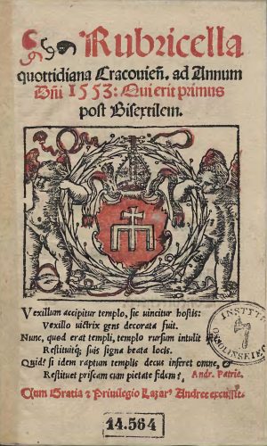
The elegant, clear and coherent heraldic composition was replaced by an even more decorative image in the following year. In 1552 Andrysowic placed Zebrzydowski’s coat of arms within a wreath held by two putti, modifying Vietor’s earlier woodblock (fig. 3).
Fig. 3. Title page of Rubricella quottidiana Cracovien[sis] ad annum D[omi]ni 1553 Qui erit primus post Bisextilem (Cracow: Łazarz Andrysowic, 1552), Ossoliński National Institute, shelfmark XVI.O.1064. Source: Lower Silesian Digital Library (public domain).The use of red, apart from its appearance in the coat of arms, has mainly decorative functions and one can wonder if the printer did not push it too far by filling the putti wings with red colour. He must have been content with the effects as he impressed the same two woodblocks in six subsequent editions of Rubricella quottidiana until 1558.
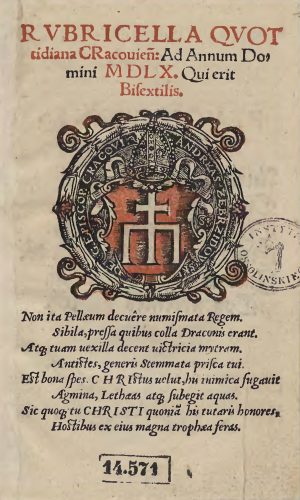
In 1559 he changed the composition again and arrived at a very elegant and medal-like image that might have pleased humanistic-minded viewers (fig. 4). Red complied with the heraldic colours of the coat of arms and, apart from the cartouche, was moderately and accurately used to colour the ribbons and flowers on the wreath.
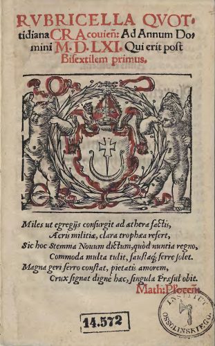
Fig. 4. Title page of Rubricella quottidiana Cracovien[sis] ad annum Domini M D L X. Qui erit Bisextilis (Cracow: Łazarz Andrysowic, 1559), Ossoliński National Institute, shelfmark XVI.O.1070. Source: Lower Silesian Digital Library (public domain).Yet, Zebrzydowski died in 1560 and Andrysowic needed to introduce the coat of arms of Filip Padniewski (bishop of Cracow in 1560-1572) onto the title page of the subsequent Rubricella quottidiana. The problem was that Padniewski’s coat of arms had no red. His Nowina consists of a silver cauldron’s handle with both ends upwards and a sword between them, all placed within a blue shield. Blue ink, because of the high price of the pigment, was extremely rare in sixteenth-century Polish prints, so Andrysowic had to come up with another solution. He reworked the line woodblock used already in Rubricellae quottidianae printed between 1552 and 1558 and replaced the Radwan coat of arms with the Nowina. He also had a new block made to print the red colour, which he used to decorate the contour of the coat of arms, the mitre and ribbons (fig. 5).Fig. 5. Title page of Rubricella quottidiana Cracovien[sis] ad annum Domini M.D.LXI. Qui erit post Bisextilem primus (Cracow: Łazarz Andrysowic, 1560), Ossoliński National Institute, shelfmark XVI.O.1080. Source: Lower Silesian Digital Library (public domain).Luckily, this time he abandoned the idea of printing the angels’ wings in red. The same matrices were reprinted on the subsequent Cracow rubricellae until 1569. In the same period red-and-black coats of arms of clergymen also made their appearance in other prints by Andrysowic. For instance, the title page of Epitome totius Veteris et Novi Testamenti carmine elegiaco conscripta (Cracow, 1561) with the red-and-black Trzaska coat of arms of the abbot of the Benedictine monastery in Lubiń, Paweł Chojnacki, had a similar composition to Rubricellaequottidianae. In turn, Catechismus elementa pietatis Christianae (Cracow 1561) has the Półkozic coat of arms of the bishop of Chełm, Mikołaj Wolski, printed in red and black ink on the verso of the title page.
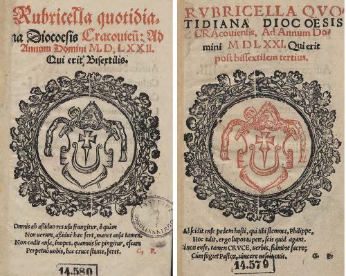
It was not easy for other Cracow printers to emulate the use of the red-and-black coat of arms introduced by Andrysowic. Matthaeus Siebeneicher, who took over the printing of Cracow liturgical calendars in 1570, initially attempted to print Filip Padniewski’s coat of arms in red (fig. 6), even though this has no basis in the heraldic tradition. He started the same way Andrysowic did in 1550, namely avoided overlap of colours and printed the coat of arms and the wreath from two separate woodblocks. Yet, already in the second edition of his Cracow rubricella he gave up on the idea and limited himself to a black-and-white heraldic composition (fig. 7).
Fig. 6-7. Title pages of Rubricella quotidiana diocoesis Cracoviensis ad annum Domini MDLXXI. Qui erit post bissextilem tertius (Cracow: Matthaeus Siebeneicher, 1570), shelfmark XVI.O.1074, and Rubricella quotidiana diocoesis Cracovien[sis] ad annum Domini MDLXXII. Qui erit post bissextilem tertius (Cracow: Matthaeus Siebeneicher, 1571), shelfmark XVI.O.1073, both from Ossoliński National Institute. Source: Lower Silesian Digital Library (public domain).Apart from Rubricella Quotidiana for 1572 no other Siebeneicher attempts to print images in colour are known. Łazarz Andrysowic’s experiments with ruber in Cracow rubricellae remain exceptional, if not extravagant, in the sixteenth-century Polish print market.
Quoted literature:
Juda, Maria, 1992. Przywileje drukarskie w Polsce [The privileges of printers in Poland], Lublin: Agencja Wydawniczo-Handlowa AD.
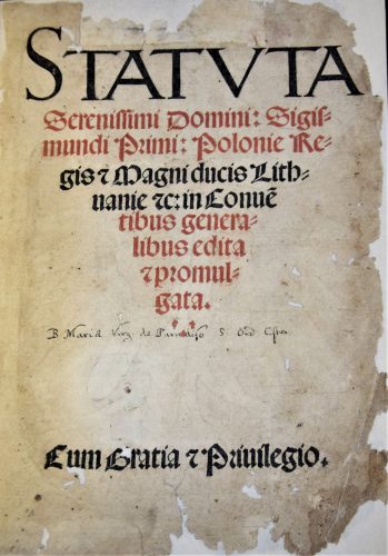
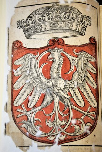
If an image was printed in colour, it was generally printed in red. If it was printed in sixteenth-century Poland, it was most commonly the Polish coat of arms, namely the White Eagle with a crown, in a red shield. Typically the heraldic eagle in the red shield appeared in the title pages of official documents, mainly constitutions promulgated by the Polish Parliament. The earliest known example is the so-called Sigismundian Eagle, that is the heraldic eagle with the monogram of the king Sigismund I (1507–1548), printed from two woodblocks in register in the first three editions of the Statuta serenissimi domini Sigismundi Primi Poloniae Regis (edition A of 1524, edition B printed before the end of 1531 and C before 1538), a collectionof constitutions from 1507–1523, released by Hieronymus Vietor (and after his death by his wife Barbara) at least eleven times between 1524 and around 1550 (Piekarski, 1929).
Red was at the top of the hierarchy of heraldic colours. As pertinent to popes, emperors and kings, it was the most frequently used colour in medieval coats of arms (Pastoureau 2017: 74). Its practical value, the fact of its easy discernibility to the human eye, further justifies the popularity of red in heraldry. It was the visibility of red that caused its frequent use in the identification devices on the battlefield, from which the coat of arms originates. Likewise, the heraldic symbolism of red referred to bravery and gallantry (Kuczyński 1978: 93). Perhaps it was in these meanings that red appeared on the battle standards of the Polish dukes from the Piast dynasty. As heraldic colours were absolute and conceptual, their shades did not matter (Pastoureau 2017: 74). This eased the work of the printers, who used the same red ink to print texts and coats of arms, as was the case of Hieronymus Vietor.
Fig. 1. Title page of Statuta serenissimi domini Sigismundi Primi Poloniae Regis (Cracow: Hieronymus Vietor, 1524), title of Statuta printed in red and black, National Library in Warsaw, shelf-mark SD XVI.F.1016. Photo by Karolina Mroziewicz.
The A, B and C editions of Statuta had six lines of the title and three small crosses on the title page printed in red (fig.1). The same ink was used to impress the red shield on the verso of the title page (fig.2).
Fig 2. The Sigismundian Eagle on the verso of the title page of Statuta serenissimi domini Sigismundi Primi Poloniae Regis (Cracow: Hieronymus Vietor, 1524), heraldic image printed from two woodblocks in red and black in register, National Library in Warsaw, shelf-mark SD XVI.F.1016. Photo by Karolina Mroziewicz.
Even though the colour woodcut came out of the press of a renowned printing house, its technical awkwardness demonstrates the main difficulties which even an experienced printer had to face when impressing a colour coat of arms. The first challenge was to register the two blocks in relation to one another. This was not fully successful in Statuta as the red colour goes over the parts of the image which should remain white and obscures the black contour (fig.2). The second problem was the consistency of the red ink. In several studied impressions the ink seeped through the title paper and left a stain on the eagle head. Sometimes the red dots of ink used on the verso of the page are clearly visible on the title page and build up a contour of the Eagle’s wings (as for instance in the copy of Statuta held in the collection of the Princes’ Czartoryski Library/National Museum in Cracow, shelf-mark 29 III Cim). The penetration of the ink through the page suggests that the ink recipe needed improvement. Perhaps these technical complications discouraged Vietor from printing colour in the subsequent editions. Certainly, it was not the deterioration of the woodblock used to impress colour, as it was still in decent shape in the C edition. The line blocks were generally impressed in Vietor’s Statuta as long as possible, regardless of their poor physical shape (cf. fig.3). Even though the colour might have drawn attention away from the faults of the woodblock, it was not considered to be an easy option.
The Sigismundian Eagle with the closed crown (Latin corona clausa) above its head, printed by Vietor, is a combination of the state coats of arms with the monogram of the current king and the symbol of the sovereignty of his power. The closed crown was a characteristic imperial regalia and was used in the iconography of the last Jagiellon rulers in Poland to manifest the idea of the king being an emperor in his own kingdom (according to the Latin phrase rex imperator in regno suo). This mixture of state, royal and personal symbols was unusual in European heraldry. As Mieczysław Morka claims, it was more common to link the ruler’s initials with another emblem in the cases when one intended to stress a feudal dependency between the ruler and a particular territory (Morka 2006: 323). Morka suggests that the close interplay between the state emblem and the king’s name could have been a part of royal propaganda, a manifestation of the unity between the ruler and his kingdom.
Fig. 3. The Sigismundian Eagle on the verso of the title page of Statuta serenissimi domini Sigismundi Primi Poloniae Regis (Cracow: Hieronymus Vietor, [around 1550]), heraldic image printed in black from a worn-out woodblock, National Library in Warsaw, shelf-mark SD XVI.F. 732. Source: POLONA (public domain).However, the link between the heraldic eagle and the persona of the king had a long tradition. In the Polish lands the White Eagle was used first by Piast dukes as their personal emblem from around the first quarter of the thirteenth century, then it was adopted by the whole dynasty, and since the unification of the kingdom after the feudal partition, it became the official state symbol (Jaworska 2003: 44-79). Ladislas the Short (crowned in 1320) and his son Casimir III (crowned in 1333) used the white eagle with the crown in their royal seals to manifest the political and territorial unity of the kingdom. The latter also placed his monogram next to the heraldic eagle on his royal seal and coins. The king’s monogram also appeared in the official iconography of the subsequent Polish rulers, Wladislas Jagiellon (1386–1434), Casimir Jagiellon (1447–1492) and Alexander (1501–1506), but did not play a significant role in their system of royal symbols. It gained new importance in the visual representations of Sigismund I who closely observed the propagandistic trends at the Hungarian royal court and at the imperial court of the emperor Maximilian I (Piech 2003: 323).
Interestingly, the earliest depictions of the Sigismundian Eagle are preserved in Cracow prints. They were impressed on the title pages (fig.4) or as a figural initial (fig.5) from 1518 onwards (Morka 2006: 323-324). If red colour was applied to these images, in each case it was done manually. Vietor was the first to print the Sigismundian Eagle in colour. By placing it at the beginning of the collection of constitutions of the Polish Kingdom he also introduced this emblem into the system of official state symbols. Yet, as far as we know, nobody after Vietor printed the Sigismundian Eagle in red. The subsequent experiments with impressing the Polish coat of arms in colour were undertaken only by Vietor’s successor, Łazarz Andrysowic, in the 1560s. Łazarz learnt his profession as an apprentice in the printing office, which after Vietor’s death was directed by Barbara Vietor. He married the widow, took possession of Vietor’s office and continued its legacy, also in heraldic colour printing. Nevertheless Łazarz was more successful in introducing printing in register to the production of heraldic woodcuts, as the elaborate coat of arms of the Polish kingdom, impressed on the title page of Statuta Regni Poloniae by Jan Herburt (around 1564) in his printing house, was reprinted several times until 1641.
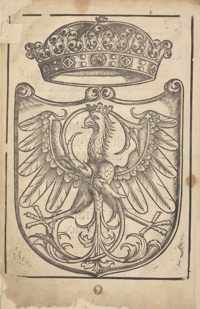
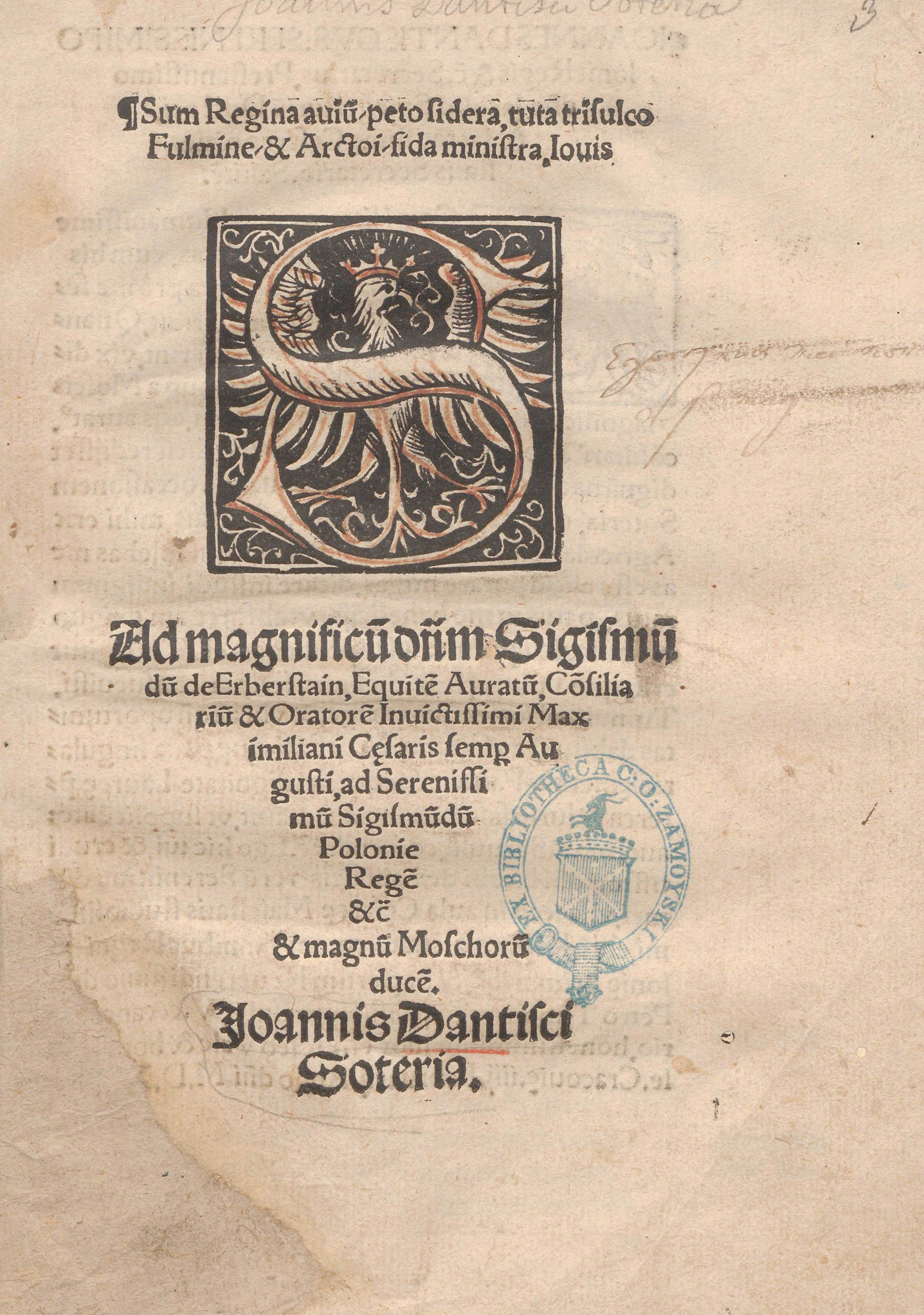
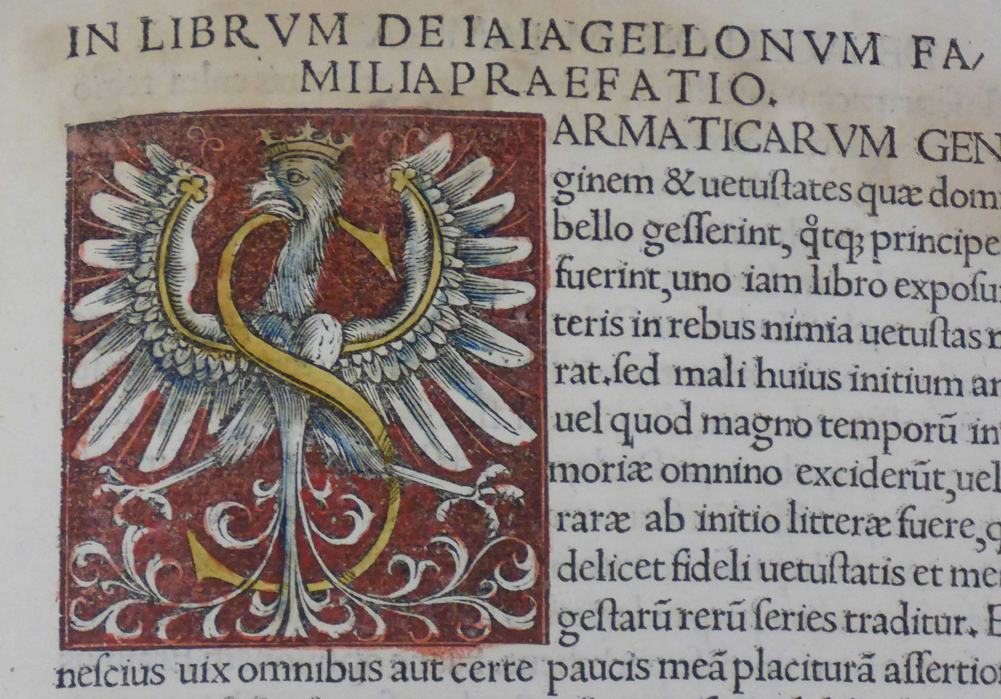
Fig. 4. The Sigismundian Eagle on the title page of Ad magnificum dominum Sigismundum de Herberstein, ad victoriossisimum Sigismundum Poloniae regem Rudolphi Agricolae iunioris congratulatio (Cracow: Johannes Haller, 1518), hand-coloured woodcut, National Library in Warsaw, shelf-mark SD XVI.Qu.183. Source: POLONA (public domain).Fig. 5. Initial S in: Jodok Ludwik Decjus, Contenta: De vetustatibus Polonorum Liber I. De Iagellonorum Familia Liber II. De Sigismundi Regis Temporibus Liber III (Cracow: Hieronymus Vietor, 1521), hand-painted woodcut, unnumbered page, National Museum in Kraków (MNK), inv. no. MNK VIII-XVI-264. Photo by Karolina Mroziewicz. I thank the Museum for its kind permission for the publication of the photo.
[expand more_text=”Show more” less_text=”Show less” height=”120″ hide_less=”no” text_color=”#333333″ link_color=”#B26B70″ link_style=”default” link_align=”left”]Quoted literature:
Jaworska, Aleksandra, 2003. Orzeł Biały. Herb państwa polskiego [The White Eagle. The coat of arms of the Polish state]. Warszawa: Wydawnictwo DiG.
Kuczyński, Stefan Krzysztof, 1978. “Barwy biało-czerwone” [White-and-red state colours]. In: Stanisław Russocki, Stefan K. Kuczyński, Juliusz Willaume, Godło, barwy i hymn Rzeczypospolitej. Zarys dziejów [Coat of arms, colours and anthem of the Republic of Poland: Brief history], pp. 83-256. Warszawa: Wiedza Powszechna.
Pastoureau, Michel, 2017. Red: The History of a Color, translated by Jody Gladding. Princeton, New Jersey: Princeton University Press.
Piech, Zenon, 2003. Monety, pieczęcie i herby w systemie symboli władzy Jagiellonów [Coins, seals and coats of arms in the system of Jagiellonian symbols of power]. Warszawa: Wydawnictwo DiG.
Piekarski, Kazimierz, 1939. „Uwagi o chronologii wydań statutów sejmowych z czasów Zygmunta Starego“ [Notes on the chronology of editions of parliamentary statutes from the times of Sigismund the Old]. Przegląd Biblioteczny 3: pp. 478-495.
Morka, Mieczysław, 2006. Sztuka dworu Zygmunta I Starego. Treści polityczne i propagandowe [The art of the Court of Sigismund I the Old. Political and propagandistic content]. Warszawa: Argraf.