Tag Archives: missals

Distinguished by Colour: Initials in two Copies of Missale Cracoviense (1515/1516)

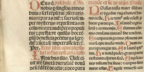
The early printed missals were dominated by two colours: black and red. This diversification of type colour played a practical role and was used already in the manuscripts. At the beginning the printing of both colours simultaneously was more expensive and complicated technically because it demanded the separate printing of each colour. Therefore, sometimes in the early incunabula the blank spaces were left and filled in with red text manually (Ikeda 2015: 65; König 2018: 267). These red fragments, called rubrics from the Latin ruber (red), described the commentaries and remarks for priests which were not supposed to be read to the faithful. Nigrics, from the Latin niger (black) were the prayers in black which should be read during the service (King 1957: 181-182). It is interesting that it was red, the more visible colour, which signalled the silent parts.

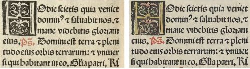
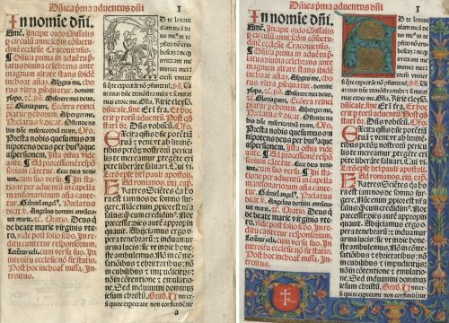
However, the use of colour was not only limited to the printed text. Hand-colouring was the main method of decorating woodcuts such as whole-page images and initials. Sometimes,  colour was used to emphasise the most important parts of the liturgy or prayers. The variety of initials as well as their modifications can be discussed on the example of two copies of Missale Cracoviense printed c. 1515/1516 by Johannes Haller in Cracow. The copy with no manual colouring is preserved in the Kórnik Library of the Polish Academy of Sciences (shelf-mark Cim.F.4107) while the illuminated copy is held in the Ossoliński National Institute in Wrocław (shelf-mark XVI.F.4053).

Fig. 1. Red printed initials and floral bordure in: Missale Cracoviense, 1515/1516 (Cracow: Johannes Haller), Ossoliński National Institute, Wrocław, shelf-mark XVI.F.4053, hereafter referred as copy A, fol. y2v. Source: Lower Silesian Digital Library (public domain).

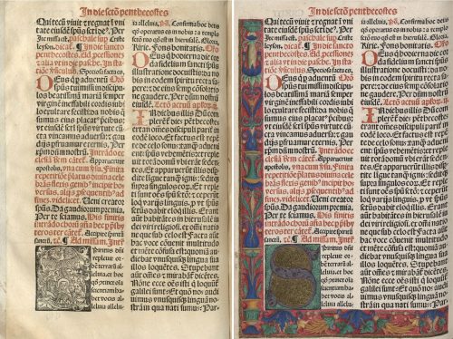
These two liturgical books included few kinds of initials, differentiated by size and ornamentation. The first group was the same in both copies. It consisted of very simple, slightly bigger, two-line letters, printed in red (fig. 1, fig. 2). In most cases they marked the beginning of the paragraphs.

Fig. 2. Red printed initials in: Missale Cracoviense, 1515/1516 (Cracow: Johannes Haller), Kórnik Library of the Polish Academy of Sciences, shelf-mark Cim.F.4107, hereafter referred as copy B, fol. y2v. Source: Wielkopolska Digital Library (public domain).

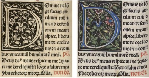
The rest of the initials were black and white woodcuts, coloured manually in the case of the copy held in Ossolineum. Three-line initials were the second and the most considerable group (fig. 3). The letters were inscribed in a square while the background was filled with various floral motives. In the illuminated copy the majority of initials was painted by hand according to the scheme: a monochromatic letter and another or few other hues for the ornament.

Fig. 3. Initial H in: Missale Cracoviense, 1515/1516, fol. b1v: copy B (left), copy A (right).

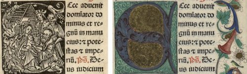
Similar in form, but much bigger, were six- and eight-line initials, consisted of letters entangled in flowers, tendrils or geometrical shapes (fig. 4). In the illuminated copy one or two colours were used to decorate the letter and few others to paint the rest of the motives.

Fig. 4. Initial D in: Missale Cracoviense, 1515/1516, fol. r6v: copy B (left), copy A (right).

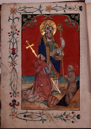
 In each of these cases the letters and other elements remained visible, the only change was the addition of colours. Nevertheless, significant changes appeared in the group of the biggest and the most elegant initials. In the uncoloured copy of the missal one can see figural initials, scenes which were connected directly to the proper part of liturgy, for example: the Nativity, the Magi, the Resurrection, the Assumption of Mary or the Trinity. In the colourful copy these scenes were painted so thoroughly that they were not visible (fig. 5). Woodcuts disappeared under a thick layer of paint. It covered the fleshy floral contours of the letters completely, while the spaces inside the letters were filled with gold. Maroon, red, blue, green and violet dominated this decoration. Presumably, such dark hues were used in order to cover the lines of the composition better.

Fig. 5. Initial E in: Missale Cracoviense, 1515/1516, fol. c3r: copy B (left), copy A (right).

These carefully designed hand-painted decorative elements were complemented with an exquisitely illuminated bordure made of floral and architectural ornaments. Such decorations on margins appeared only in combination with the most elegant initials, so they were meant to emphasise the indicated part of the text. The first page following the calendar part was decorated with an initial A and a bordure with vases and floral motives such as flowers, tendrils and leaves (fig. 6).

Fig. 6. Missale Cracoviense, 1515/1516, fol. a1r, copy B (left), copy A (right).

A distinctive element in the bottom left corner of the page was the Prus coats of arms in a wreath. The name written on the shield (Joannes Schikowsky) referred directly to the alleged owner of this exemplar, Johannes Szykowski (d. 1535), a clergyman, related to the cathedral in Cracow and the parish priest of Gnojno. A specific and local floral motif, which appeared on another page, twigs, leaves and flowers of carnation, was recognized as another feature which led to the same person. This characteristic element was connected with the ex-libris of Johannes Szykowski with four carnations flanking the composition (Gruczyński 1967: 57). Unfortunately, the original location of the bookplate is unknown. Zofia Ameisenowa made an assumption that it was made in the woodcut workshop working for the Cracow printer Florian Ungler c. 1530 (Ameisenowa 1947: 14-15; the connection between the two bookplates, the woodcut and the painted one, was, however, partially undermined by Anna Lewicka-Kamińska (1970: 143-146)).

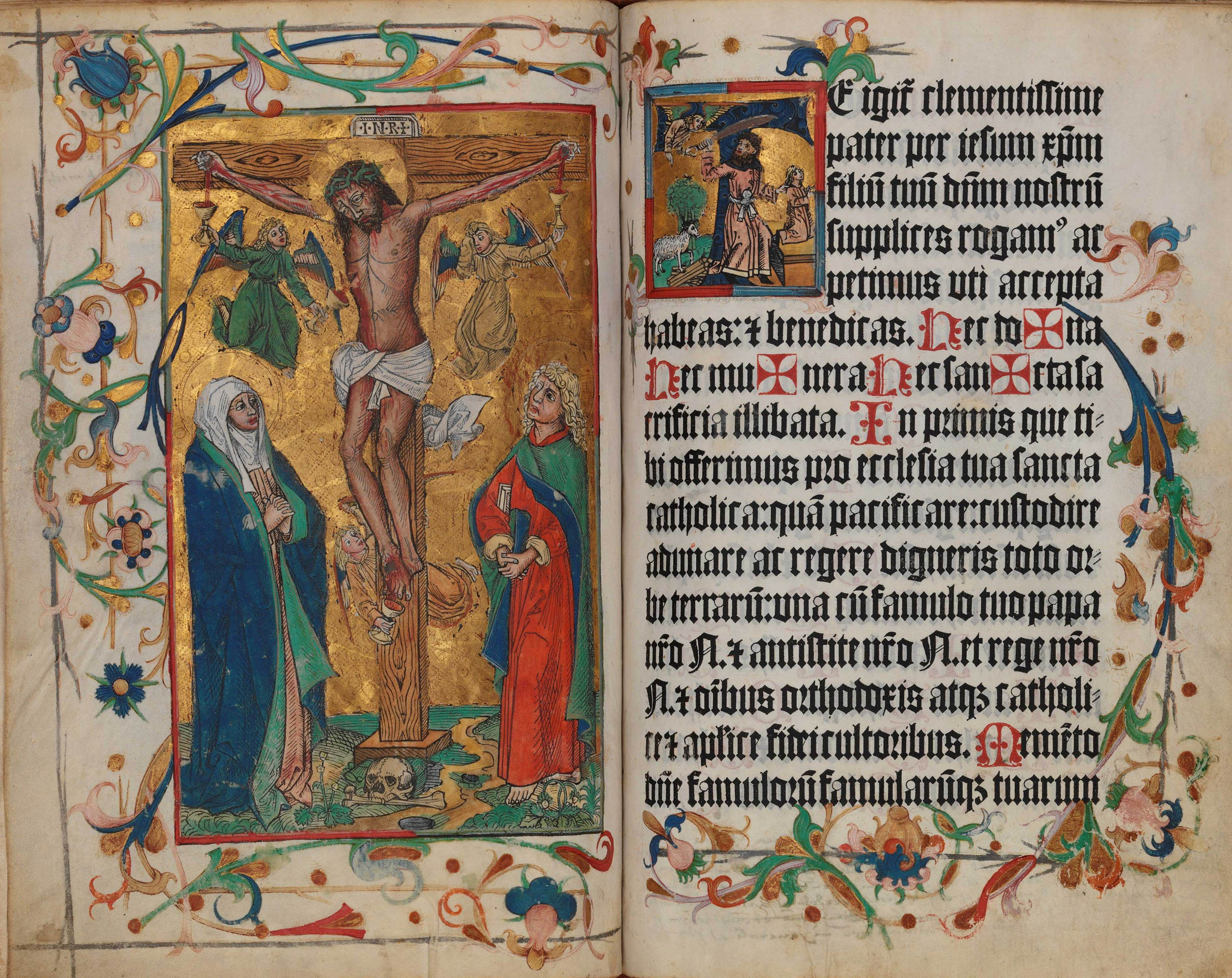
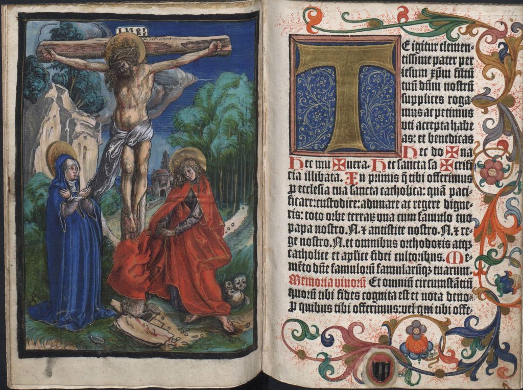
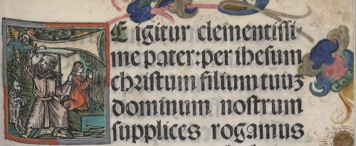
The floral bordure, which surrounded the text from three sides, occurred also on the first page of the Canon in the illuminated copy of the book. This special part of the missal, printed on the parchment and containing the most important liturgical prayer, begins with the words “Te igitur”, starting with the letter T. Its shape was associated with the cross and, therefore, in many cases it was decorated in an exceptional way. In this copy of Missale Cracoviense it was the five-line initial with a figurative scene, the only one in the whole book which had not been painted over. It represented the sacrifice of Isaac, which, within this context, referred directly to the sacrifice of Christ as God’s only Son (fig. 7).

Fig. 7. Initial T in: Missale Cracoviense, 1515/1516, fol. a2r, copy A.

The Canon part was preceded by the whole-page woodcut depicting Crucifixion. It is worth noticing that its colours referred to other elements of decoration. First of all, the hues resembled the ones used in the biggest initials with gold. Second of all, the double frame of the woodcut corresponded to the figural initial on the adjacent page. Red used in the inner frame and grey used in the outer frame were repeated in the initial. This colour scheme brings the two images even closer to each other and suggests a direct connection between the meaning of these two scenes. Unfortunately, the copy held in Kórnik lacks the Canon part, which prevents further comparisons and conclusions.

An elegant and refined decoration of illuminated copy of the Missale Cracoviense consisted of five kinds of colourful initials, coloured Crucifixion and a subtle ornamental bordure. Covering the figural initials with paint so thoroughly that they were invisible can be an evidence of a strong attachment to the medieval way of perceiving a book. The owner of the illuminated copy must have been a bibliophile, for whom the colour added manually to the printed book had a special artistic and aesthetic value. Yet, the illuminations which he had commissioned did not respect the original iconographic programme of the book. The original meaning and function of the most significant initials have been lost in the illuminated copy of the Missale (fig. 8). By means of colour the illuminator has interpreted the iconography of the missal and, at the same time, created, in fact, a new work of art.

Fig. 8. Missale Cracoviense, 1515/1516, fol. q3v: copy B (left), copy A (right).

Quoted literature:

Ameisenowa, Zofia 1947. Dwa nieznane polskie znaki książkowe z XVI wieku [Two unknown Polish sixteenth-century bookplates]. Kraków: Towarzystwo Miłośników Książki.

Gruczyński, Stanisław, 1967. “Ekslibris Jana Szykowskiego” [Jan Szykowski’s bookplate]. Roczniki Biblioteczne, vol. 11, no. 1/2: pp. 55-61.

Ikeda, Mayumi, 2015. “The Fust and Schöffer Office and the Printing of the Two-Colour Initials in the 1457 Mainz Psalter”. In Printing Colour 1400-1700, edited by Ad Stijnman and Elizabeth Savage, pp. 65-75. Leiden, Boston: Brill.

Kawecka-Gryczowa, Alodia, 1983. “Haller Jan.” In Drukarze dawnej Polski, pp. 44-62.

King, Archdale A., 1957. “Rubrics”. In: Liturgy of the Roman Church, pp. 181-183. London: Longmans.

König, Eberhard 2018. “Colour for the Black Art”. In Painting the Page in the Age of Print: Central European Manuscript Illumination of the Fifteenth Century, edited by Jeffrey F. Hamburger, Robert Suckale, Gude Suckale-Redlefsen, translated by David Sánchez, pp. 265-290. Toronto: Pontifical Institute of Mediaeval Studies.

Lewicka-Kamińska, Anna 1970. “Ekslibris Anonima herbu Prus I” [The bookplate of the Anonim of the Prus coat of arms I]. Biuletyn Biblioteki Jagiellońskiej, vol. 20, no. 1/2: pp. 141–146, il. 12.

Between Miniature and Print: Colour in Two Editions of Missale Cracoviense

The relationship between miniature and print in the early sixteenth-century liturgical book was very close. During the Middle Ages liturgical books were copied manually. This resulted in changes, errors, omissions, which caused serious differences between them and, therefore, in the rites of the liturgy. Since the half of the fifteenth century the attempts to minimise this incoherence of texts were made by the popes, but the process lasted long and was difficult to control. In 1453 Pope Nicholas V demanded that within a year all parishes should have corrected their missals according to the cathedral missals. Nevertheless, it was still unsuccessful until the printing method enabled such demands to be more realistic.

At that time liturgical books started to be standardised, at least within the dioceses. Bishops ordered the same printed liturgical books and made the parishes buy them. In such a way they tried to unify the liturgy. Catholic Church’s councils and synods demanded to buy and use only confirmed texts. The fact that each diocese was supposed to use only the missals or breviaries prepared especially for them, increased the demand for the printed book and contributed to the development of printing in the Polish lands.

Cracow was one of the first Polish centres where such a reform began. At the turn of the fifteenth and sixteenth centuries the main entrepreneur in Cracow was Johannes Haller. He used his connections with the clergy and secured himself by getting the privilege from Fryderyk Jagiellończyk, the bishop of Cracow and the archbishop of Gniezno for printing the liturgical books. Such privileges were given by the clergy or rulers in order to secure the rights of the publisher and prevent others from printing the same book.

An exclusive right gained by Haller to print the two variants of Missale Cracoviense, was one of the first privileges for printers at all (Juda 1992: 33-34). Before each new edition Haller renewed the privilege and, therefore, he was assured of getting a lot of commissions and a stable income. In order to publish these missals for the Cracovian diocese, Haller started to cooperate with Georg Stuchs, a minor printer from Nuremberg. These two examples were one of the first missals commissioned by Haller (Kawecka-Gryczowa 1983: 45-47). Furthermore, they were printed abroad before he started his own publishing house in Cracow.

The first one, the copy of which is preserved in the Jagiellonian Library in Cracow (shelf-mark Inc. 2861), was printed probably just after granting the privilege, ca. 1494. Pages of the missal were decorated both with miniatures and hand-coloured woodcuts. These prints were initials and two whole-page figurative scenes: Saint Stanisław Resurrecting Piotrowin accompanied by Fryderyk Jagiellończyk (fig.1) on the title page and Crucifixion (fig.2) on the page preceding the Canon Missae. Canon was the most important part of the book, often printed on parchment whereas the rest was printed on paper. According to tradition, which goes back to the handwritten missals, it started with the representation of the Crucifixion. The woodcut from this copy of Missale Cracoviense was coloured manually with water-based pigments in a typical, limited palette: blue, green, yellow and red (Primeau 2013: 3). The most intensive spots of colour were the Virgin’s and Saint John’s clothes. Also, the angel’s dress and wings were painted with intensive dark green while the parts of the wings of all angels were painted dark blue, green and orange. The colouring is very precise and only very few places are left without any hue, the most visible one being the Apostle’s feet. It seems that even the use of green in the crown of thorns was thought to fit the other elements well.

Fig. 1. Saint Stanisław Resurrecting Piotrowin accompanied by Fryderyk Jagiellończyk in: Missale Cracoviense (Nuremberg: Georg Stuchs, ca. 1494), full-page hand-painted woodcut on parchment, unnumbered title page, Jagiellonian Library, Cracow, shelf-mark Inc. 2861. Source: photo by the Photographic Studio of the National Museum in Cracow.
Fig. 2. Crucifixion in: Missale Cracoviense (Nuremberg: Georg Stuchs, ca. 1494), full-page hand-painted woodcut on parchment (washed in colours, partially painted in gold), unnumbered page, before the Canon of the Mass, Jagiellonian Library, Cracow, shelf-mark Inc. 2861. Source: photo by the Photographic Studio of the National Museum in Cracow.

It is significant that the image of the crucified Christ was very often one of the biggest colourful elements in the whole book. As Primeau suggested “the addition of colour made the images more eye-catching, naturalistic and legible” (Primeau: 2). It seems that the function of colour was to catch the eye of the user and make them stop and contemplate the image of suffering Christ. Such interpretation can be confirmed by the statement that “hues have conveyed meanings that brought the viewer into a closer connection with the divine” (ibid.: 2).

An important and typical feature was the Saviour’s blood which flowed on his head and neck, on arms and hands as well as on the stomach, legs and feet. The presence of blood was an inherent element of coloured scenes of Crucifixion. As the “good” type of red it symbolised the purification and redemption (Adamska 2015: 13; Dackermann 2002: 29-30). The well-considered colouring was emphasised even more by the golden background and halos around the figures’ heads. It is worth noticing that the black frame, typical for the woodcuts, was coloured in an alternate way, in green and red. Again, it seems to be a well-thought idea which fulfils the whole work of art.

The margins of the woodcut were surrounded with an elegant, floral frame composed of flowers. The use of gold and the double frame, the tiny one and a very decorative floral frame on the margins made this composition elegant and precious. One can assume that such form was thought to catch the viewer’s eye and let him admire and contemplate the scene. This elegant way of colouring, distinguished by the golden background, makes the woodcut look more as a miniature than a print. Although the style of the illuminations is already different from earlier ornaments, the way of colouring the woodcuts indicates that it still represented the medieval way of thinking.

Another example of such imitation is the second edition of Missale Cracoviense, which was smaller and destined to be used during travelling. Its copy is also held in the Jagiellonian Library in Cracow (shelf-mark Inc. 2850). This liturgical book was commissioned by Haller and printed by Stuchs in Nuremberg between 1493 and 1500. In this case the scene on the title page (Saint Stanisław Resurrecting Piotrowin accompanied by Fryderyk Jagiellończyk) is uncoloured, only the halo of the saint was painted in gold. Sixteen pages were decorated with hand-coloured woodcut initials and floral illuminations on the margins.

An interesting addition was the woodcut by Lucas Cranach the Elder depicting Crucifixion (fig. 3) which was subsequently pasted on a page before the Canon Missae. It was impressed on parchment and painted very thoroughly with opaque paints (Jurkowlaniec, Herman 2021: 3-4). The scene is much more extended in comparison to the Crucifixion of the ca. 1494 edition of Missale (cf. fig. 2). The figures are not so stiff while the landscape background is full of details. The two prints represent different attitudes of composing space and human figure. Both examples are very precious and elegant, the colour is intensive in each case. However, the shiny golden print stands in contrast with the opaque paints of Cranach’s work. This print is really exceptional because of the subtlety and diversification of colours as well as the lights marked with the white paint. Gold was used here in the halos and as a tiny addition to the saints’ clothes.

Fig. 3. Lucas Cranach, Crucifixion in: Missale Cracoviense (Nuremberg: Georg Stuchs, ca. 1494-1500), full-page hand-painted woodcut on parchment (washed in colours, partially painted in gold), unnumbered page, before the Canon of the Mass, Jagiellonian Library, Cracow, shelf-mark Inc. 2850. Source: photo by the Photographic Studio of the National Museum in Cracow.

All in all, the two editions of Missale Cracoviense are good examples of the infiltration between miniature and print. The manner of painting woodcuts almost thoroughly so that the lines were hardly visible as well as the use of gold and decorative floral motives on margins confirm the thesis that these colourful elements imitated the decoration of illuminated manuscripts. Moreover, it proves a high demand that the liturgical books should still resemble the well-known medieval form.

Quoted literature:

Adamska, Anna, 2015. “Gra w kolory. Rola barw w średniowiecznym systemie komunikacji społecznej” [Playing with colours: the role of colours in the medieval system of social communication]. Roczniki Historyczne 81: pp. 7-34.

Dackermann, Susan, 2002. Painted Prints: The Revelation of Color in Northern Renaissance & Baroque Engravings, Etchings & Woodcuts. Baltimore: Baltimore Museum of Art; University Park: Pennsylvania University Press.

Juda, Maria, 1992. Przywileje drukarskie w Polsce [The privileges of printers in Poland], Lublin: Agencja Wydawniczo-Handlowa AD.

Jurkowlaniec, Grażyna, Herman, Magdalena, 2021. “Introduction”. In The Reception of the Printed Image in the Fifteenth and Sixteenth Centuries: Multiplied and Modified, edited by Grażyna Jurkowlaniec and Magdalena Herman, pp. 1-23. New York: Routledge.

Kawecka-Gryczowa, Alodia, 1983. “Haller Jan.” In: Drukarze dawnej Polski, pp. 44-62.

Primeau, Thomas, 2013. “Coloring Within the Lines: The Use of Stencil in Early Woodcuts,” Art in Print”, 3/ 3. Available online: https://artinprint.org/article/coloring-within-the-lines-the-use-of-stencil-in-early-woodcuts/ (accessed: 20.11.2020)